Designing for Delight and Impact: How Small Interactions Sparked Big Engagement Gains
Drove a 40% lift in mobile participation and turned everyday actions into meaningful impact.
IMPACT
The team launched the first fully native mobile experience - driving a 40% lift in participation and expanding engagement beyond desktop. By simplifying complex web flows into quick, rewarding mobile interactions, the MVP set a scalable foundation for future features while validating mobile as a key engagement driver.
ROLE
Product vision, end-to-end UX design, user research, interaction design, prototyping, usability testing, visual design, cross-functional collaboration
TEAM
Product manager, iOS and Android engineers
PROBLEM
Uncovering friction and finding opportunity
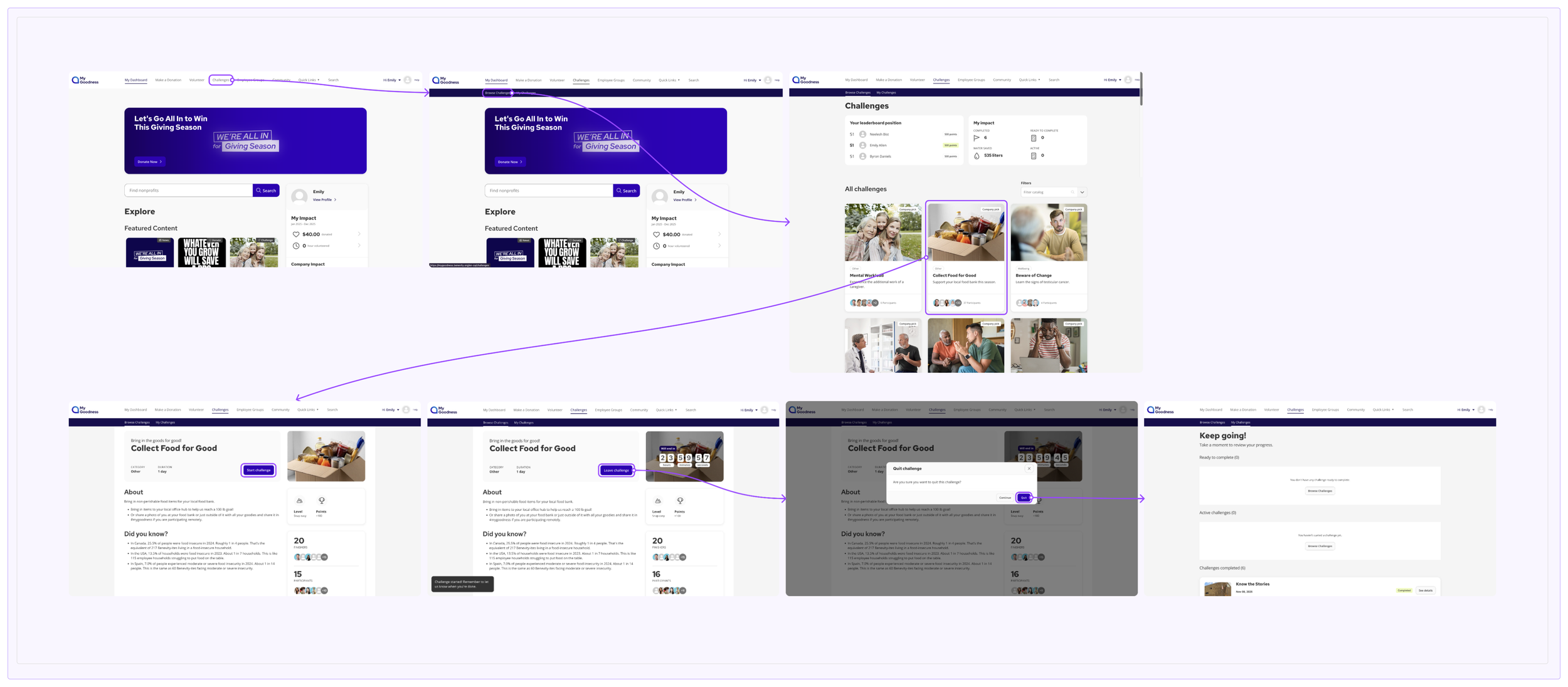
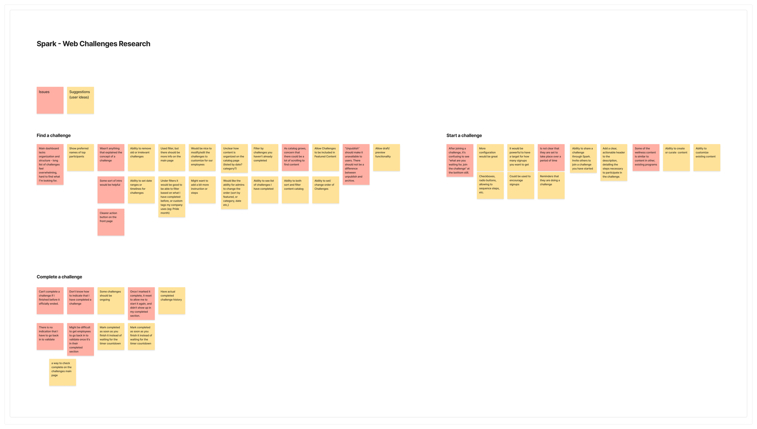
To ensure that existing research and data was taken into account, I analyzed the existing web Challenges experience to identify usability pain points and behavioral gaps that could derail a mobile experience.
3 CORE FRUSTRATIONS
⏱
Web flows were time-consuming and text-heavy, not suited for on-the-go users
✅
Users wanted fewer steps and instant confirmation upon completing actions
⚖️
Layouts didn’t scale gracefully across different screen resolutions
⭐️
These insights revealed a clear opportunity to combine simplicity, social engagement, and rewarding feedback loops to drive repeat participation and delight.
📱
Implement a simple, easily accessible filtering interaction using familiar native mobile components and patterns.
🔀
Display prominent visual badges on each challenge card. Maintain an accessible history or activity for ongoing and completed challenges.
RESEARCH
So, what did this mean for the mobile experience?
Before mapping the flow, I researched native mobile interaction patterns to ensure the Challenges experience translated intuitively from web to mobile. This led me to bottom sheets as the most familiar pattern for filtering, and a carousel of quick-access filters at the top of the screen for low-friction, on-the-go browsing.
🔔
Use push notifications to provide timely, encouraging nudges to prevent users from forgetting they are participating in a challenge.
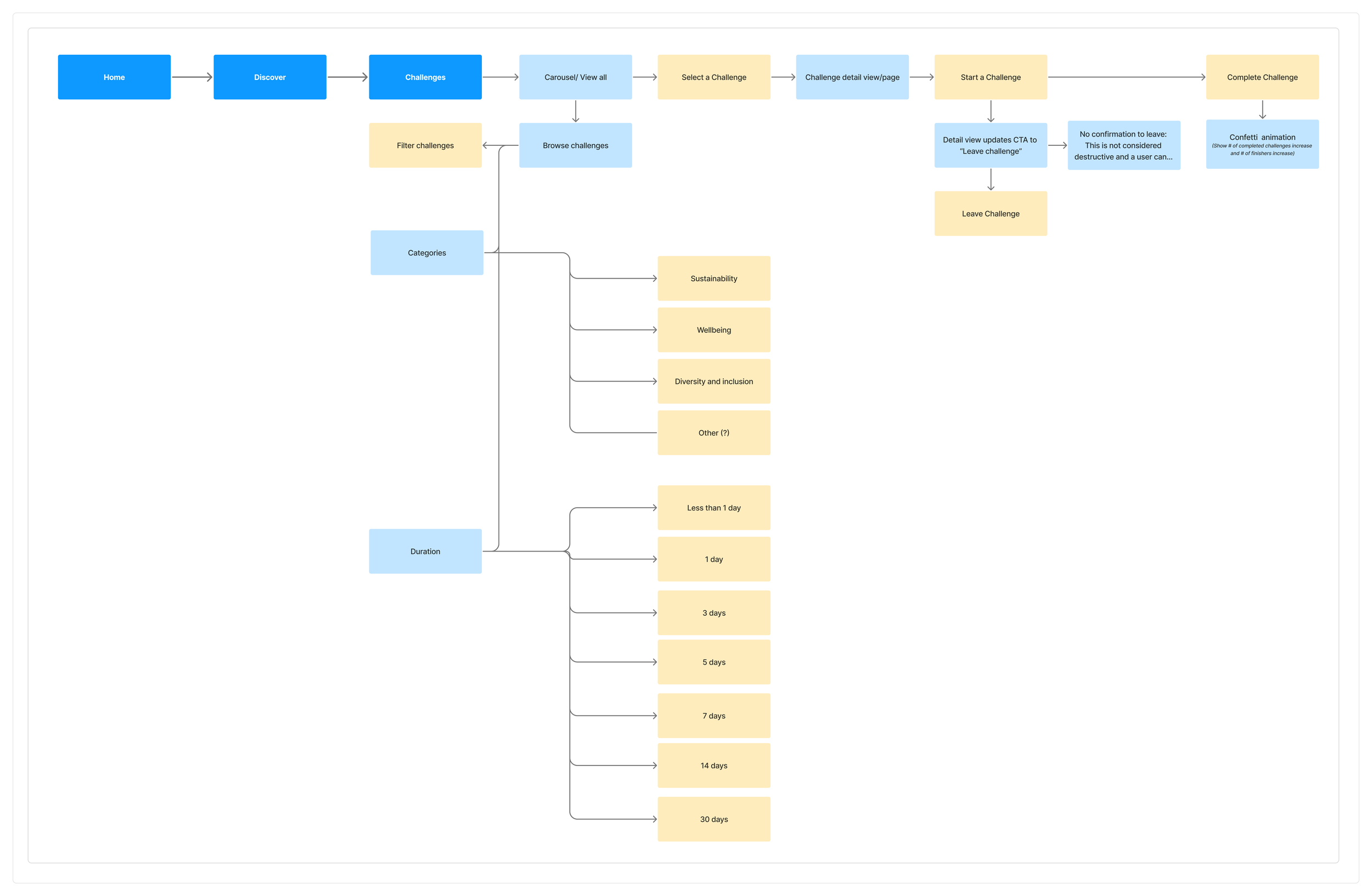
Defining the core mobile journey
With these patterns in mind, I went on to map the end-to-end journey into four key established workflows.
1
Discover challenges (browse or filter by category/ duration)
2
View details and start a challenge, stay up-to-date with push notifications directly to your device
3
Ability to track remaining days and leave a challenge at any time
4
Complete a challenge and receive celebratory feedback instantly
Testing, iterating and elevating the experience
I led multiple rounds of usability testing with internal users and external participants. Rather than testing for aesthetic preference, I focused on comprehension, flow clarity, and motivation.


1
Streamlined the completion flow to minimize the number of taps required, allowing users to finish a challenge faster and with less friction
2
Refined confirmation and feedback messaging to clearly communicate task completion and next steps, reducing user hesitation and uncertainty
3
Simplified filter patterns for smaller screen resolutions, ensuring responsive adaptability
DESIGNS
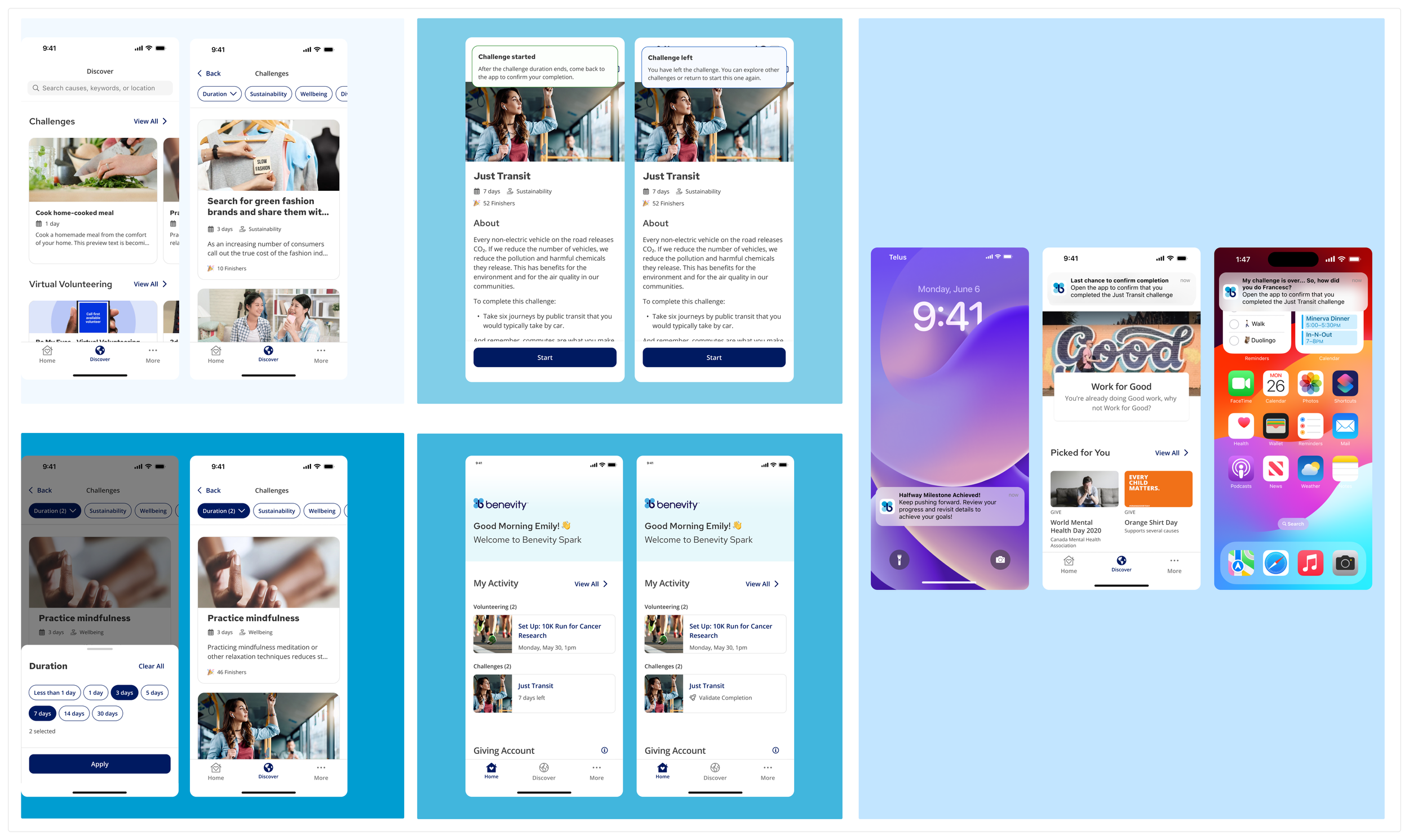
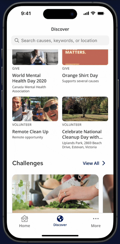
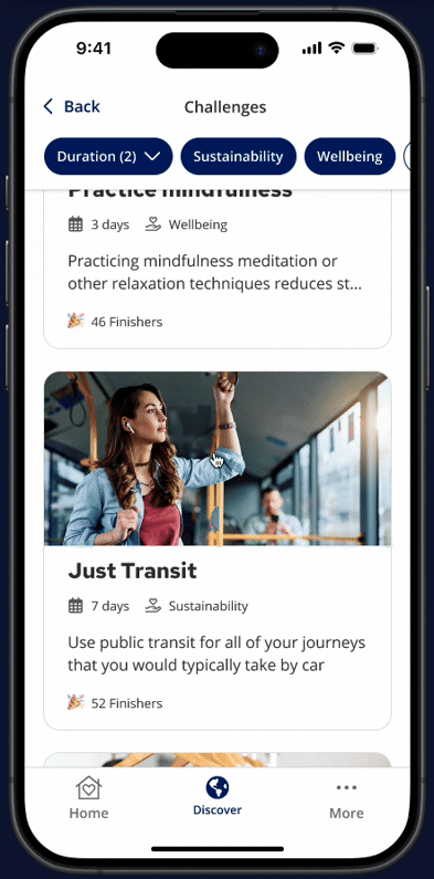
Discover challenges
Find your next good deed in seconds! The goal was to make Challenges a primary entry point - elevating it from a secondary web section by integrating a dedicated carousel directly into the highly-frequented Discover tab, leveraging existing browsing habits to drive adoption.
Each challenge card was designed to be scannable: a compelling image, clear title, and social proof (finisher count) let users assess relevance and popularity at a glance.
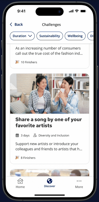
Filtering to find relevant challenges
Horizontal scrollable filter chips replace the dropdowns and sidebars common on web, making filtering instant and thumb-friendly.
A single tap lets users narrow by Duration, Sustainability, Wellbeing, Diversity and Inclusion and Other - surfacing manageable commitments that fit real schedules and enabling participation in micro-moments.
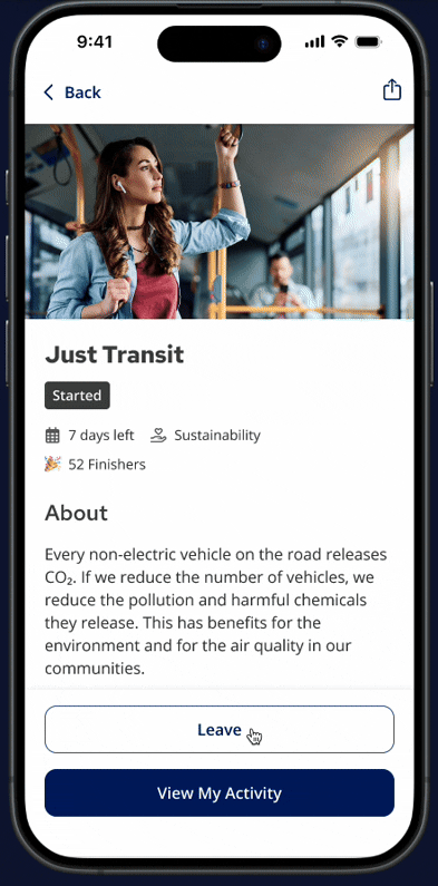
Starting a challenge
The challenge detail screen surfaces the "About" section, duration, and social activity upfront, giving users the transparency to commit with confidence.
A thumb-zone "Start Challenge" button triggers an instant "Started" state, keeping the flow from browsing to action seamless and fast.
Leaving a challenge
The "Leave" option sits secondary to the primary action to prevent accidental taps, but remains easy to find.
A lightweight confirmation prevents accidental exits, respecting the user's time and signaling that the platform values choice over forced participation.
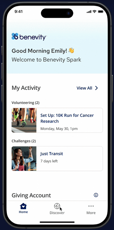
Validating a challenge
Tapping a challenge from the Home screen opens the validation flow directly, removing the need to navigate deep into the app. Once completed, a full-screen confetti animation delivers immediate, sensory recognition, creating a dopamine feedback loop that directly addresses the original pain point of low reward. This celebration is exclusive to mobile, and intentionally so.
🚀
Mobile as a growth channel
Quick, rewarding actions drove repeat visits and increased overall platform usage.
IMPACT
Prioritizing simplicity, speed, and instant gratification resulted in a significant shift.
📲
Unlocked mobile for the first time
Users could act on-the-go, a platform first.
🏗
Built to scale
Introducing gamification proved the foundation for leaderboard and team progress
🎉
Dopamine-driven reward
The celebration loop created a dopamine-driven cycle that kept users coming back.