
WestJet In-flight Experience, The Ultimate Digital Companion: Empowering Users to Control Entertainment and Connectivity
Designing a Seamless Experience: Onboard, enjoy movies, TV shows, games, internet access, and more...
IMPACT
As a result of this strategic overhaul of the mobile app, we are positioned to expand WestJet's competitive presence among premium airlines. By delivering a premium, contemporary, and lightweight design, we directly enhance the In-flight Entertainment experience,the app's most frequently used feature to meet the critical need for accessible, offline entertainment during long-haul flights at 37,000 feet, thereby strengthening a cherished in-flight connection for WestJet guests.
ROLE
Product vision, end-to-end UX design, user research, interaction design, prototyping, usability testing, visual design, cross-functional collaboration
TEAM
Product owner, Android and iOS developers, user experience research team
PROBLEM
Understanding the Current Landscape
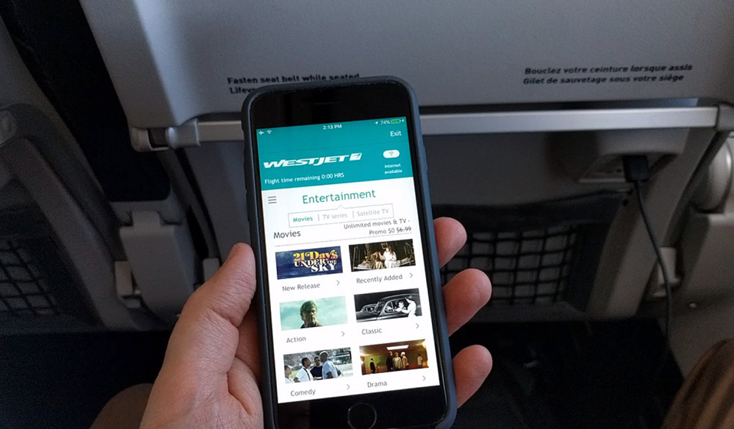
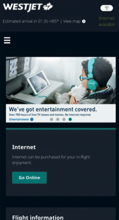
My immediate step was to delve into our existing in-flight entertainment, WestJet Connect. I compiled screenshots to fully grasp the user experience. This foundation allowed me to brainstorm enhancements, aiming for a more premium feel that could rival top-tier airline apps.
While innovation was vital, I recognized the importance of some continuity. Since guests were accustomed to the WestJet app's Connect layout, a total overhaul wasn't ideal. Retaining certain familiar elements ensured users wouldn't be starting their understanding from ground zero.


WestJet Connect pre re-design ~2019
Key Insights
The current interfaces felt outdated, despite clearly representing the WestJet brand, an airline's in-flight experience is pivotal; it should mirror the brand's excellence in customer service. The digital presence needed to be consistent with the in-person reputation.
Constraints
Gaining access to other airlines' in-flight entertainment was challenging, especially with COVID-19 limiting travel. This meant my reference mostly comprised of platforms focused on movies and TV shows. Yet, since a majority of our guests primarily use the in-flight entertainment for such content, I felt assured in capturing the essence of 75% of our platform.

RESEARCH
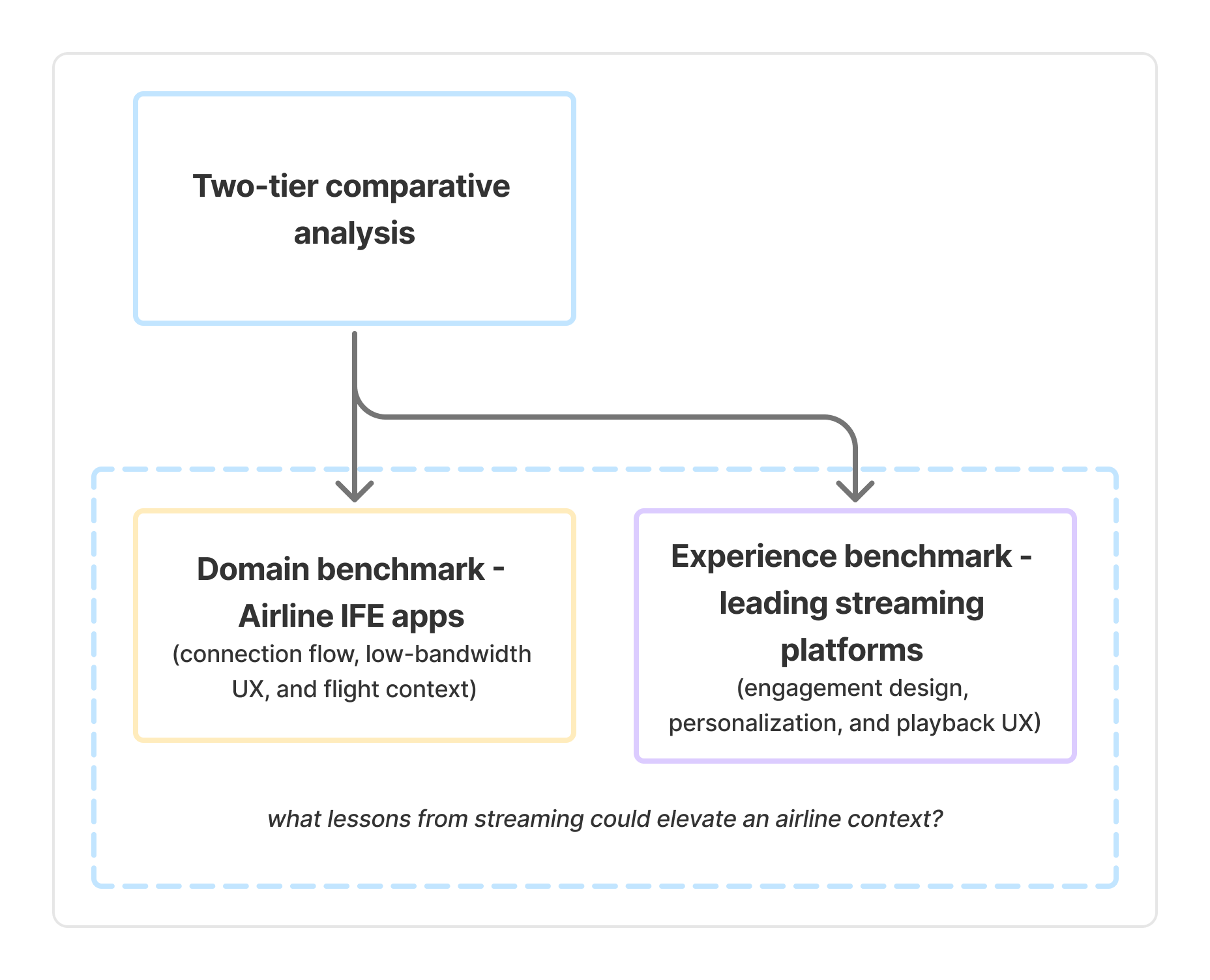
To understand how passengers engage with in-flight entertainment across the industry, I reviewed the mobile experiences of major airlines including Delta, American Airlines, Air Canada, and Emirates. The analysis focused on connection onboarding, content discovery, and playback continuity, the key moments influencing passenger satisfaction and ease of use.
I looked horizontally at airline apps, but also vertically at best-in-class entertainment UX patterns from streaming leaders.

*Based on available public documentation, user reviews and flight-experience posts; experiences may vary by aircraft type.
Visual systems vary widely, but few strike a balance between aesthetics, accessibility, and clarity under travel conditions.
Key takeaways:
Fragmented connection flows, often dependent on web portals.
Minimal personalization — “one size fits all” content discovery.
Playback often fails gracefully; poor recovery after connectivity loss.
Visual design varies widely; accessibility inconsistencies common.
The WestJet redesign opportunity lies in creating a calming, premium, and highly legible interface that holds up in low light and turbulence environments.

Aiming to reflect the WestJet identity - friendly and helpful - I looked to industry giants: Netflix and Disney+. Their vast R&D and user feedback provided quick insights into entertainment platform preferences.
Unlike airline apps, streaming leaders excel at anticipation (predicting what the user wants next) and continuity (keeping users oriented and in flow). The WestJet redesign could borrow these qualities, while adapting them to the constraints of offline or intermittent connectivity.

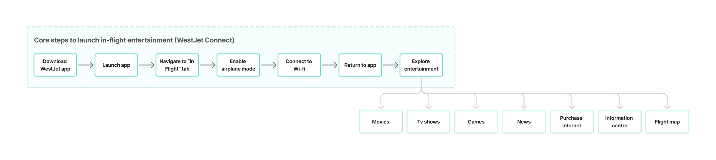
I then mapped the end-to-end journey passengers take to access in-flight entertainment on their personal devices, from downloading the WestJet app before boarding to connecting to the in-flight Wi-Fi and exploring available options like movies, TV shows, games, news, and flight information.
This mapping helped surface key friction points: passengers often struggled with unclear connection instructions, difficulty resuming playback after connectivity drops, and limited offline fallback options. These insights framed early design opportunities focused on clarity, predictability, and effortless recovery during flight.
Putting real users at the heart of every decision
Based off the audit of the existing user experience as well as performing the SWOT analysis, I landed on two personas to focus the design problem around. I chose the teal tier WestJet guest, to ensure representation of the most common tier level for guests travelling WestJet, as well as the platinum tier WestJet guest to contrast wants, and needs and ensure the re-design was addressing guests of different backgrounds with varying requirements.


Teal tier WestJet guest
Travel Frequency: Occasional
Once on board, I wish to access the In-flight entertainment promptly when available. I expect movies to be easily discoverable with a wide selection. The app's navigation should be intuitive and reminiscent of entertainment platforms I've encountered on other flights. With limited flight duration, like a couple of hours, I don't want to waste time searching; I might just fit in one movie.
Platinum tier WestJet guest
Travel Frequency: Frequent/business
On flights, movies aren't my priority. I primarily use In-flight entertainment for the flight-map and to buy internet – staying prepped for work upon landing. I want instant access to flight duration and time remaining. With flight attendants not always available, I rely on the app for flight info. I wish for a seamless transition from losing service to quickly accessing the internet onboard.
I engaged users early on to confirm and refine insights from my analysis
50 WestJet guests from a variety of WestJet rewards tiers (teal, silver, gold, platinum) were selected for user interviews.
WestJet guests were asked these questions:
What parts of the in-flight entertainment do you like the most? Why?
What parts of the in-flight entertainment did you use the least? Why?
What do you think about the way features and information are presented?
How would you rate the WestJet in-flight entertainment compared to other airlines?
Four common themes presented themselves. These themes indicated what WestJet guests valued from in-flight entertainment apps.
☺️
Ease of use and time to task
🎬
New and relevant content

🔎
Consistent and predictable search capabilities/ navigation
WestJet guest satisfaction and likelihood to recommend were strongly tied to in-flight offerings and entertainment on longer flights.

❤️
Personalization, feeling valued and recognized

Sample of testing prompts setup
DESIGN PRINCIPLES
By diving into both airline in-flight entertainment and top streaming platforms, we uncovered how users truly engage with digital experiences - insights that fuel the goals of our redesign, aiming to transform the passenger journey into something intuitive, immersive, and delightfully seamless.

These insights helped pinpoint the core opportunities to elevate the passenger journey, which I framed as a guiding design challenge:
How might we…
enhance the in-flight entertainment experience to not only look and feel premium, but also be highly usable, adaptable and personalized?
1
Design an experience that more closely represented our guests perception of us; friendly, outgoing, energetic, always willing to help out
2
Create a consistent, and seamless look and feel that represents WestJet’s brand and values by implementing personable and relatable language/ tone.
3
Reposition teal as a supporting accent and introduce a premium-feeling tone, informed by guest feedback and competitive insights.
From insight to definition: translating expectations into a premium WestJet experience
Using the Dreamliner seat-back UI as a reference point, I translated its core cues - muted navy, deeper neutrals, reduced teal, and increased whitespace - into a flexible mobile-first system that mirrors the elevated onboard experience across touchpoints.

As a team, we prioritized:
predictable content discovery
simplified navigation models
personalization that feels warm, not overwhelming
visual refinement aligned to WestJet’s evolving brand
Over things like:
major rearchitecture of content platform
expanding feature inventory
layered customization UI
heavy motion design
DESIGNS
Designing a welcome that feels personal
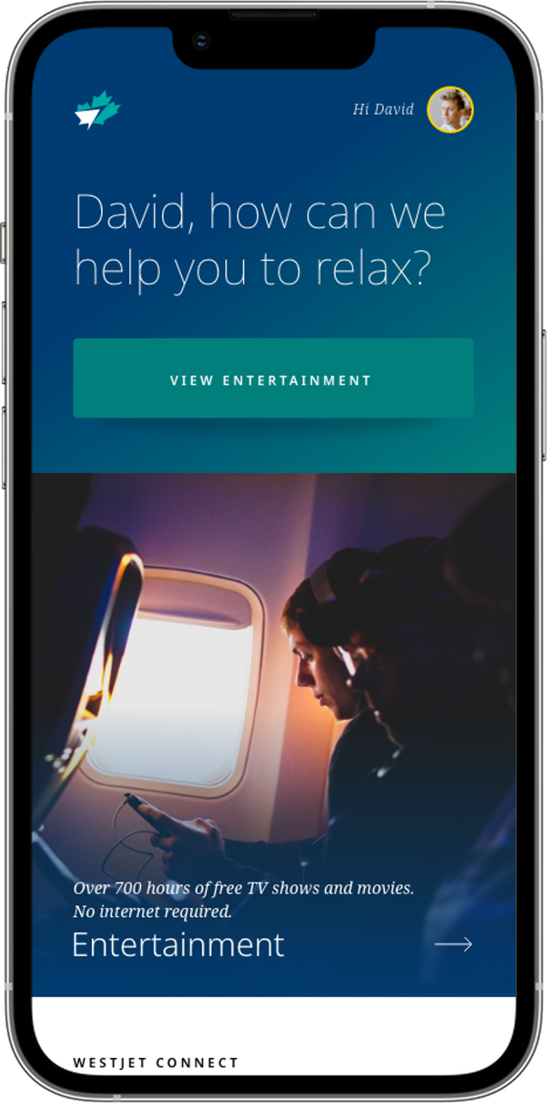
The Connect screen is the guest's first impression, a calm, confident entry point that feels immediately familiar. Warm personalization ("David, how can we help you relax?"), clear hierarchy, and a bold View Entertainment button signal ease from the very first tap. Where airline apps typically default to fragmented, text-heavy flows, this moment sets a premium, human tone and guides guests straight into discovery with zero friction.
Warm personalization: Moves beyond generic greetings to create a "you're taken care of" tone
Purposeful simplicity: Eliminates multi-step web portal friction in a single screen
Predictable interaction model: One tap in, no ambiguity - aligned with entertainment giants
Premium spacing + reduced teal: An early visual cue of the brand's shift toward elevated service, while maintaining recognition
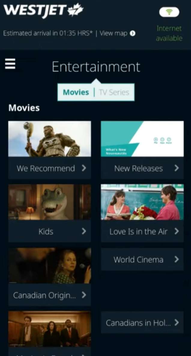
BEFORE
AFTER
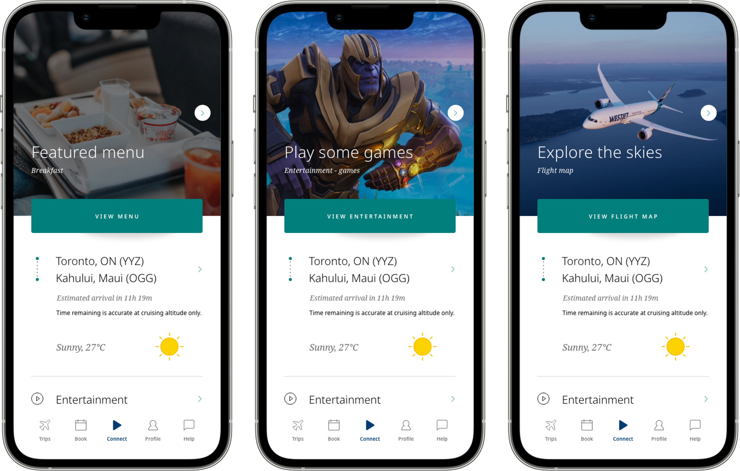
Access a variety of features and services in a single tap
The carousel applies the same anticipation logic guests know from major streaming platforms — surfacing what matters most in the moment, whether that's fresh meal options, a featured game, or the flight map, each paired with a single context-aware call-to-action. No digging, no decisions, just one tap into the moment.
Anticipatory design: Surfaces the most relevant experience without requiring choice
Emotionally warm microcopy: Friendly labels like "Play some games" humanize the interaction
Single-tap access: Eliminates the navigation friction common in competitor airline apps
Brand-aligned palette: Neutral colours with teal call-to-action buttons maintain the premium visual tone
Accessible contrast: Ensures clarity even in dim cabins or during turbulence
Your journey, your entertainment
The Entertainment section transforms in-flight downtime into a seamless moment of discovery. Bold, clear categories like Movies, TV Series, Radio, and Games, paired with subtle personalization ("David, connect to your world while in ours"), guide guests straight to what they want in a single tap. By stripping away cluttered menus and multi-step flows, the screen replaces friction with delight, familiar enough to feel intuitive and refined enough to feel premium.
Warm personalization: Moves beyond generic greetings to make each guest feel known and cared for
Purposeful simplicity: Streamlined access removes unnecessary steps, keeping the journey effortless
Predictable interaction model: One tap to access, no ambiguity, aligned with leading streaming apps
Premium spacing + refined palette: Subtle design cues signal an elevated experience while maintaining visual cohesion with the seat-back UI
BEFORE
AFTER

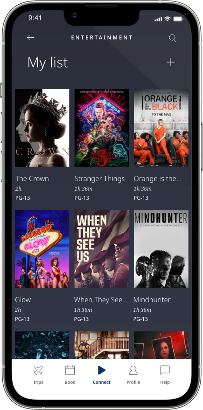
My list, always ready
My List lets guests save movies, shows, radio stations, and games for easy access throughout their flight. Built on familiar patterns from leading streaming platforms, the feature feels instantly intuitive, reducing friction and letting guests focus on enjoying the journey. The result is a personal, curated space that feels effortless and human-centered.
Familiar interaction patterns: Aligns with leading streaming apps to reduce cognitive load and increase immediate usability
Effortless curation: Quick add/remove gestures let guests manage their list without interrupting their experience
Seamless cross-content: Works consistently across movies, TV, radio, and games for a unified entertainment journey
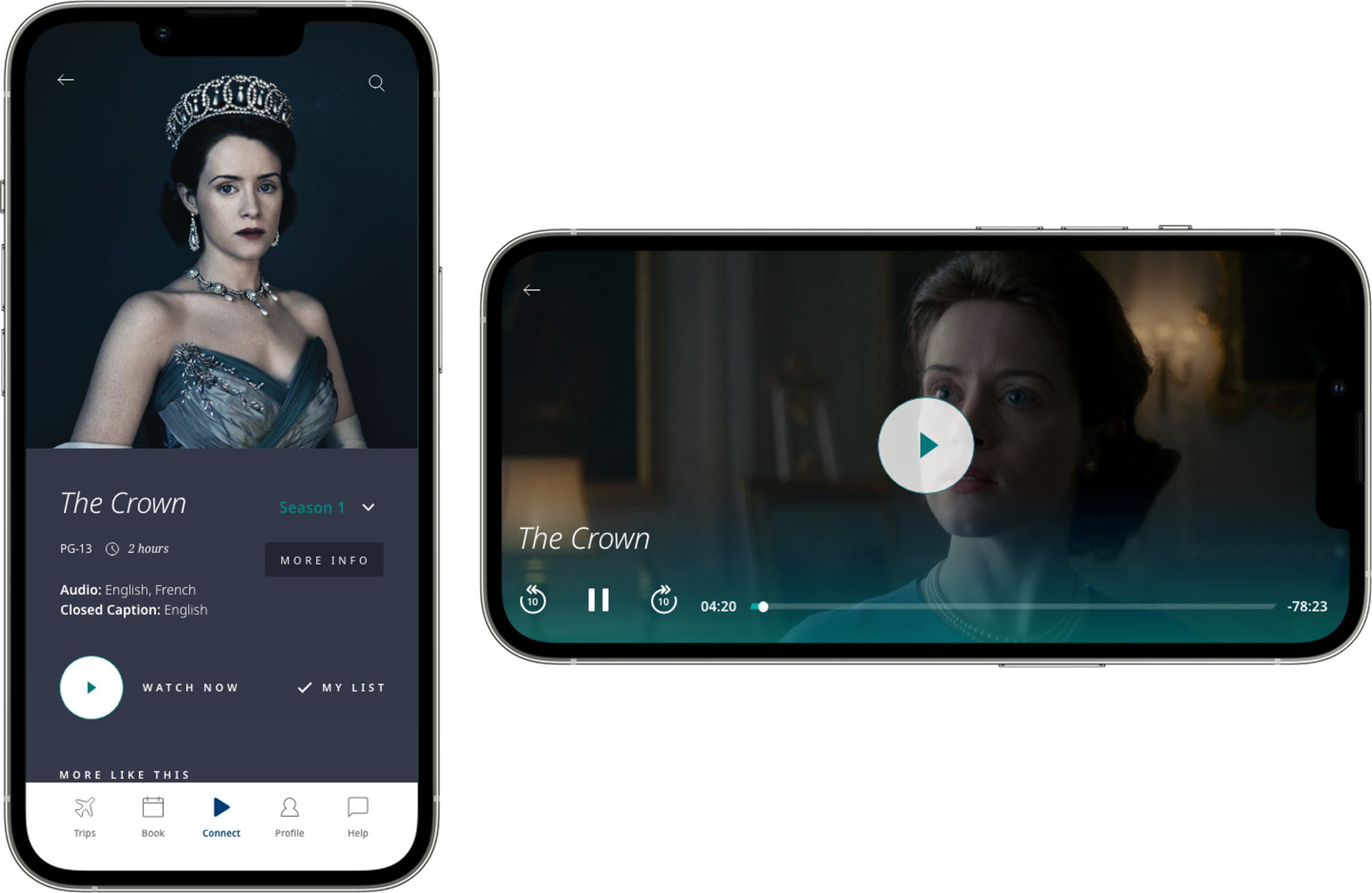
Find relevant content for you, quickly
The detail view gives guests rich context at a glance, trailers, summaries, ratings, and related content, all in one clean interface. Built on familiar streaming platform patterns, guests immediately know where to tap and what to expect, turning content decisions into a smooth, enjoyable moment.
Instant clarity: Key information and actions are prioritized so guests can decide quickly
Familiar layout patterns: Mirrors streaming app structures for immediate intuitive recognition
Action-first hierarchy: Bold, prominent Play and Add to My List buttons reduce friction
Contextual recommendations: Related content encourages discovery without overwhelming the guest
IMPACT
42%
increase in entertainment engagement
25%
of guests adopted My List within week one
36%
of guests were able to find content and start streaming faster
18%
higher in-flight satisfaction scores
2.3×
more sessions per guest
NEXT STEPS
The MVP established a seamless, premium entertainment experience, and surfaced several opportunities to elevate it further.
Destination Guide: Curated travel tips, local experiences, and highlights so guests can start exploring before landing
In-Flight Ordering: Streamlined food and beverage ordering that connects service with entertainment in one cohesive flow
Pre-Save / My List Expansion: Letting guests build their list before the flight, creating anticipation and a more tailored experience
Each concept extends the MVP's foundations toward a richer, more unified WestJet Connect ecosystem that feels intentional, warm, and unmistakably WestJet, supporting guests from takeoff to touchdown.
