Accelerating enterprise outreach through a scalable, self-serve Playbook platform
Helping banks, telcos, and utilities support customers in debt by transforming a fragmented, technical workflow into a unified, visual journey builder that non-technical teams can use with confidence.
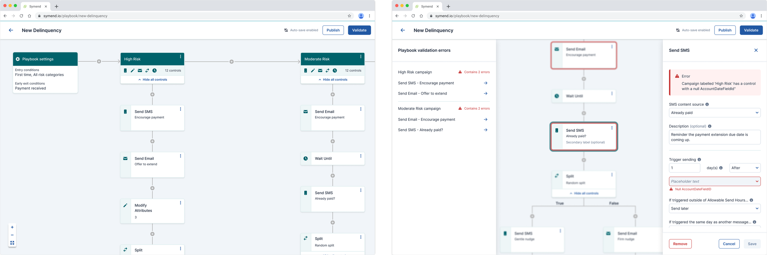
The new Playbooks experience enabled Symend’s clients to design, validate, and launch treatment strategies without relying on engineering or data science teams. This shift:
Increased user autonomy and reduced dependency on technical specialists
Unified what used to be 3+ separate apps into a single, predictable interface
Reduced configuration errors and shortened build time for new strategies
Established the design system and component foundations for future automation and governed, scalable UI
Has been used to treat 100M+ customers from debt
Impact
I was the product designer owning the Playbook designer experience and the 0→1 design system that underpinned it, across a multi-year migration from a code-based system.
Role
Team
I worked in a triad with product and engineering leaders, alongside 2 product designers, 2 PMs, multiple engineers, and 1 QA. We designed within the constraints of existing back-end services and a React flow-editor library, ensuring the vision was both feasible and scalable.
High-Stakes Problem
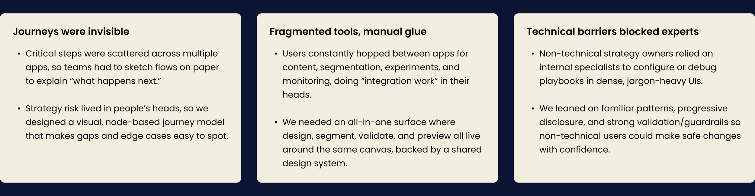
Symend helps banks, telcos, and utilities support customers in debt through tailored, multi-channel engagement strategies. Those strategies were being designed in a cluster of legacy, code-driven tools that were:
Hard to learn, easy to misconfigure, and impossible to see end-to-end
Fragmented across separate apps for campaigns, treatments, segmentation, experiments, and content
Accessible mainly to technical power users in engineering and data science
For clients and internal teams, this meant slow onboarding, high operational overhead, and real risk: the wrong outreach at the wrong time can damage customer trust and create regulatory exposure, especially at the scale of 100M+ customers.
The business needed a self-serve Playbook designer that would let non-technical teams design, validate, and iterate on treatment strategies safely in a single, unified, visual platform.
Research and analysis → key insights
Existing product audit
UI + component library review
Task-flow + navigation mapping across legacy apps
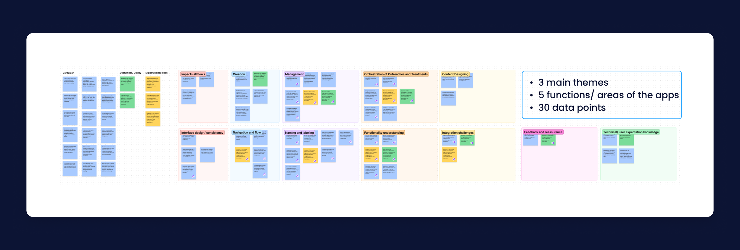
Contextual observation + interviews
Observed 8 Symend employees (Client Ops, Solutions Architects, Behavioural Scientists)
Captured 30+ data points across 5 core functional areas
Affinity mapping to synthesize themes
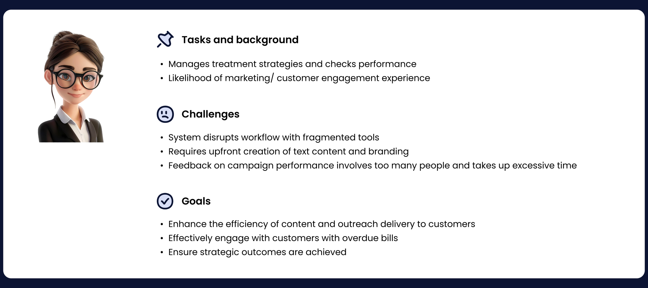
Persona creation
“Patty” – central design persona, responsible for treatment strategies and performance
External / competitive research
Feature + pattern benchmarking against tools like HubSpot, Adobe Campaign, Persado, Mailchimp
Industry best practices for journey builders, validation UIs, node-based editors
Feasibility exploration
Early pairing with engineering on a React node-based editor to understand technical constraints and opportunities
From this work, three direction-setting insights emerged:
Why this mattered
Symend’s clients rely on treatment strategies to guide how they reach millions of customers during sensitive financial moments. But the legacy approach was scattered across multiple tools, required deep technical knowledge, and left users unsure if their strategies were configured correctly.
The redesigned Playbooks experience:
consolidated multiple apps into one
reduced reliance on technical teams
improved clarity, accuracy, and confidence
empowered users to build and validate strategies independently
Impact: Playbooks became the unified way Symend clients reach and support 100M+ customers across telco, banking, and utilities.
Understanding why strategy creation was so much harder than it needed to be
Symend’s original workflow for designing treatment paths was scattered across multiple legacy tools:
one app for content
one for segmentation logic
one for sending events
and another for visualizing paths
This created:
Fragmentation - users constantly switched tools
Cognitive load - no single view of “what’s happening, where, and why”
High reliance on technical experts - only a few internal SMEs understood the system end-to-end
No visual validation - errors surfaced late, often during engineering handoff
Slow feedback loops - small changes required multi-team coordination
From interviewing strategists, data specialists, client service teams, and leads, one theme emerged clearly:
“I just want to see what’s happening and know it’s right before activating it.”
This became the opportunity: create a unified, visual, self-service Playbook builder.
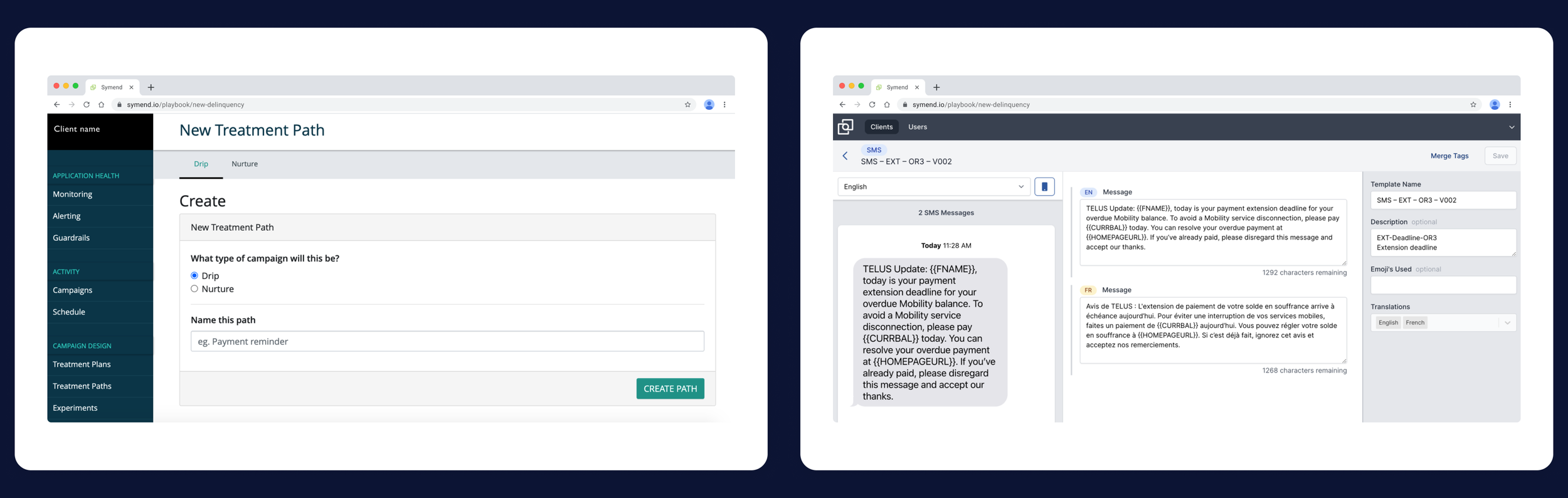
Legacy authoring tools were fragmented, inconsistent, and required technical support.
Designing for clarity, predictability, and confidence
(Placeholder visual: early flow sketches or conceptual boxes)
From the research, three design pillars emerged:
1. Put important things within reach
Users needed a way to inspect content, rules, timing, and segmentation without leaving the canvas.
2. Reduce friction through guidance
The system should proactively surface issues and guide decision-making.
3. Empower users through exploration
Playbooks needed to feel safe to experiment with—without risking broken logic or mis-configured outreach.
These principles guided the design of:
A consolidated visual canvas
Contextual side panels for editing
Familiar drag-and-drop interactions
Clear, consistent patterns for flow controls
Inline validation and error grouping
The outcome:
A single, predictable place where users could design, test, and validate a strategy from end to end.
Making complexity feel simple (and familiar)
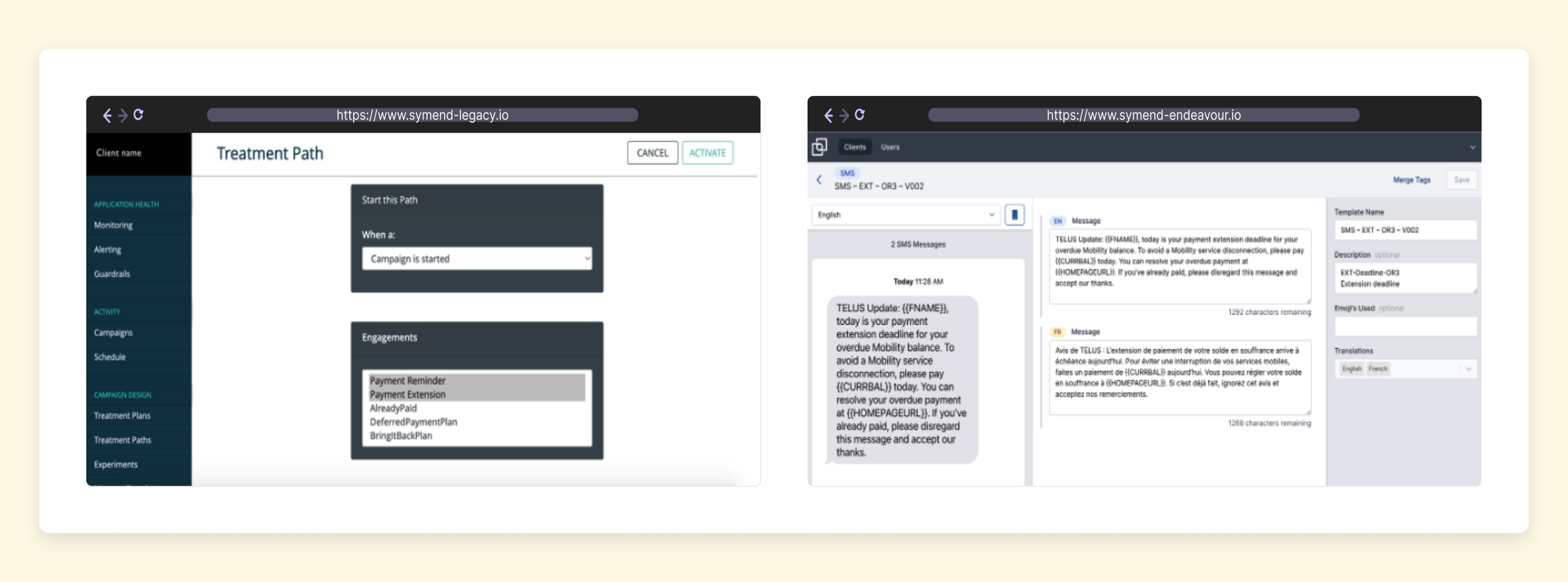
(Placeholder visual: side-by-side comparison of old vs. new card design)
To reduce the learning curve, I drew from familiar mental models:
flowchart logic (draw.io, Miro)
message builders (HubSpot)
personalization patterns (Mailchimp)
side panel editing (modern web apps like Notion / Figma)
This allowed users to:
Click any step to view details instantly
Edit messages, rules, controls, and timing from a single pattern
Move or duplicate steps intuitively
Understand the entire journey at a glance
The interface emphasized clarity:
consistent card hierarchy
intuitive iconography
semantic colors
minimized chrome
predictable placement of actions
This made even complex strategies feel manageable and easy to reason about.
The fragmented, multi-tool ecosystem we were tasked with untangling
Through interviews, shadowing sessions, and platform audits, it became clear that strategy creation was far more difficult than it needed to be. Workflows were fragmented across four different internal tools, requiring strategists to bounce between message builders, segmentation rules, and experimentation controls just to complete a single journey. Nothing existed in one place, and no one had visibility into end-to-end logic.
Strategists described the experience as:
“disconnected and fragile,”
“difficult to trust,”
and “impossible to visualize.”
This reality revealed a compelling opportunity: build a single, unified system that gives users clarity, confidence, and control from start to finish.