
Scaling Skyline, Benevity’s design system for the Age of AI
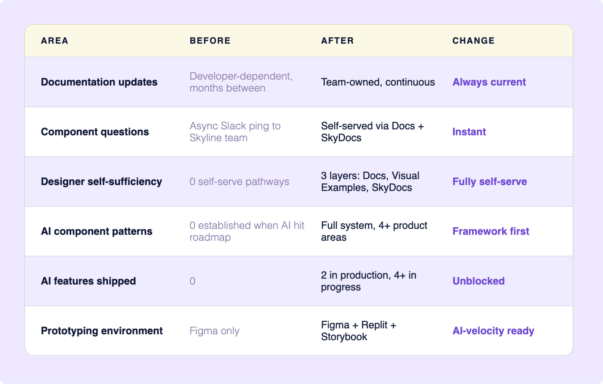
A design system only works if people can use it without asking for help. Benevity's couldn't - and AI was already on the roadmap. I identified both problems before they were assigned, proposed the solutions, and owned them end-to-end - transforming the documentation infrastructure so 13 designers could self-serve, then building the AI visual language and component system that shipped in production.
IMPACT
13 designers unblocked · 2 AI features shipped · 4+ product areas using the framework
ROLE
Product Designer - Skyline Design System · Self-directed · End-to-end
THE PROBLEM
Two problems. One broken foundation.
I joined as Skyline 2 launched - 13 designers, a 70 component library, and a doc site only 2 developers could update. Documentation untouched for months. No way to self-serve. Multiple daily interruptions pulling the Skyline team out of building.
Meanwhile AI features were landing on the roadmap with no visual language, no component patterns, no framework for responsible AI rollout on a platform processing millions in charitable giving.
BLOCKED
The product designers trying to ship
Mid-sprint, needs to know which component to use. The doc site is months out of date. She pings Skyline -pulling the team out of deep work for a question that should have a written answer.
PAYING FOR IT
The Skyline team
3 people fielding the same questions across 13 designers. Every interruption took away from time spent building the system or preparing for AI.
MAKING THE SYSTEM USABLE
Before we could build for AI, the team needed to build without us.
The fix wasn't to rebuild the doc site - it was to move documentation somewhere the whole team could own. Google Docs. Consistent structure. No developer required.
BEFORE
Custom doc site. Polished but locked — only developers could push updates.
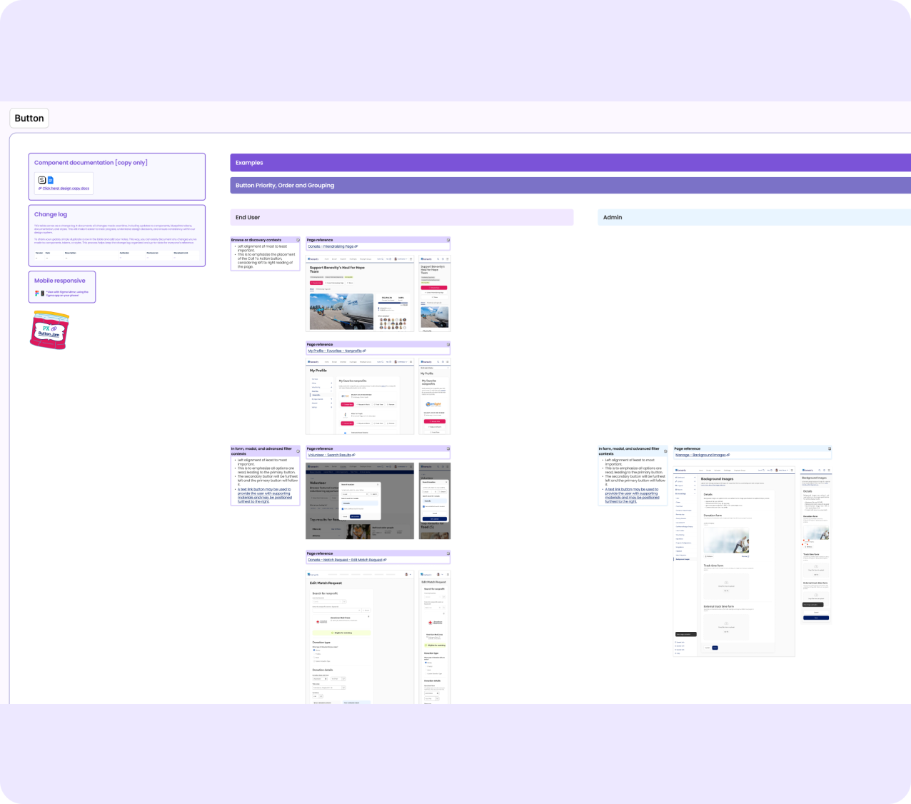
Buttons - priority, order, grouping in real product pages across end-user and admin contexts.
AFTER
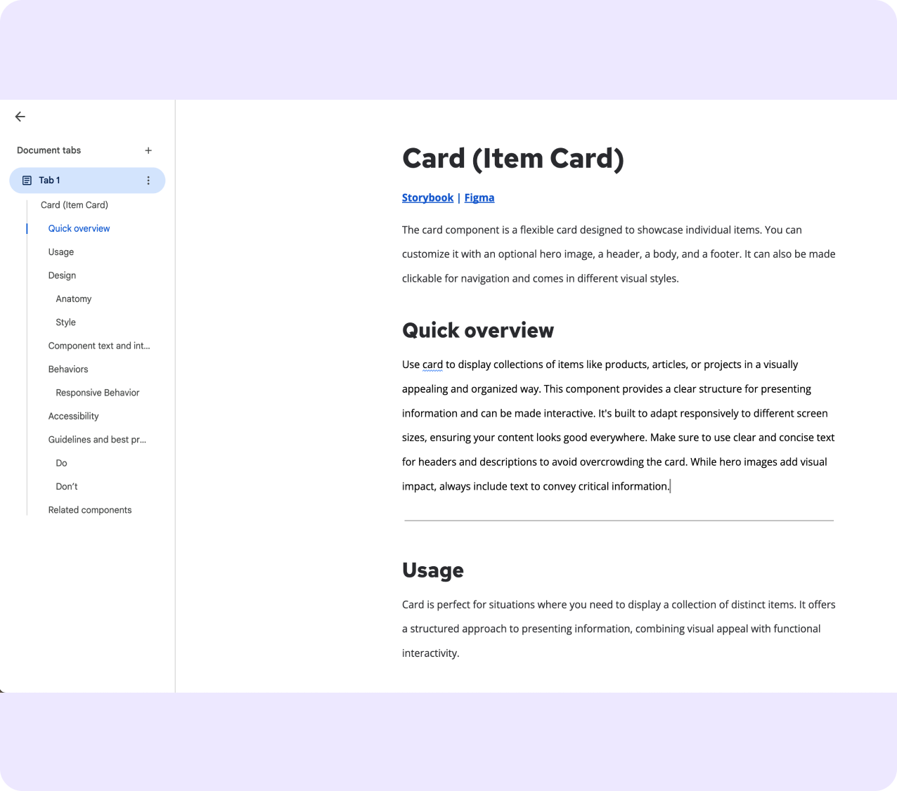
Google Docs. Scannable, structured, owned by the whole team.
VISUAL EXAMPLES
Knowing a component in isolation is different from knowing how to use it alongside others. I built a Visual Examples Figma file - components in real product contexts, end-user and admin, across breakpoints. Open it, find your context, no support ticket needed.
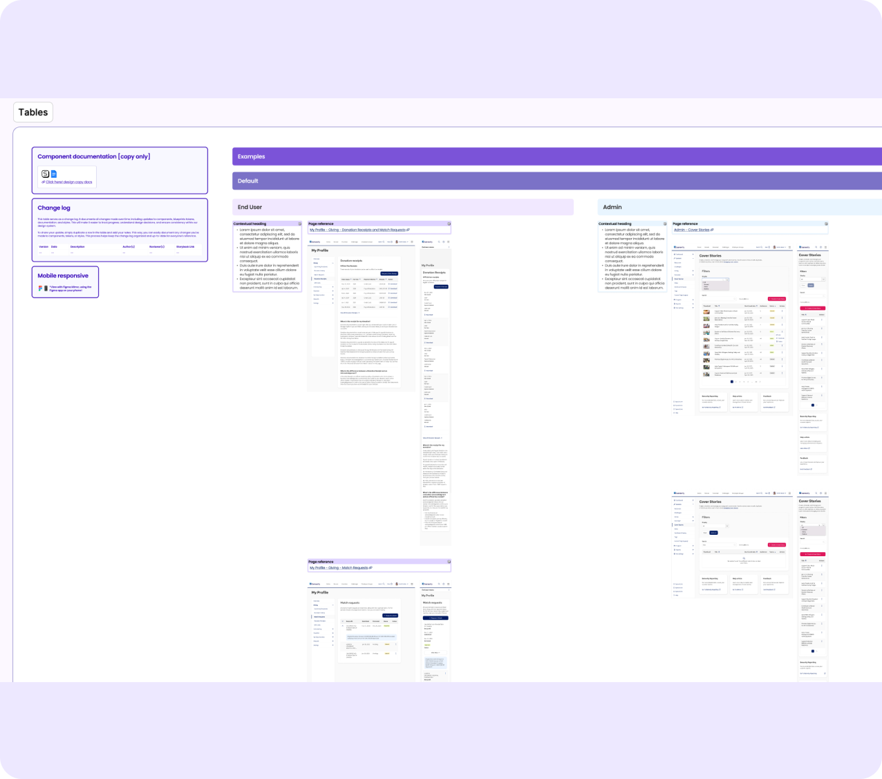
Tables - contextual loading states mapped to real screens with page references.
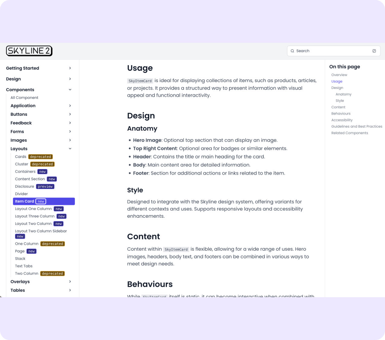
SKYDOCS - THE KNOWLEDGE LAYER
I loaded 70+ component docs into NotebookLM, known as SkyDocs - a Design and Content Consultant for the Skyline system. Ask a question, get a cited answer from the official docs. Not just documentation that exists - documentation that works.
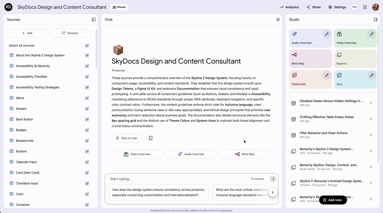
SkyDocs answering a question about button hierarchy - citing sources from 70+ component, content design, and accessibility docs.
CURRENT STATE - AI PROTOTYPING
Today the team prototypes in Replit with Storybook as live reference. Skyline travels into their AI development workflow utilizing Skyline skills. No Figma handoff required.
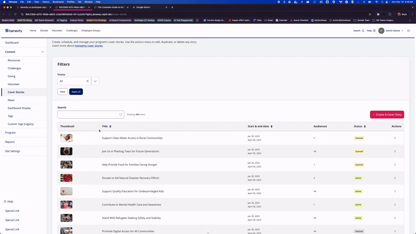
Skyline running live in Replit with Storybook as the coded reference - prototyping at AI development speed
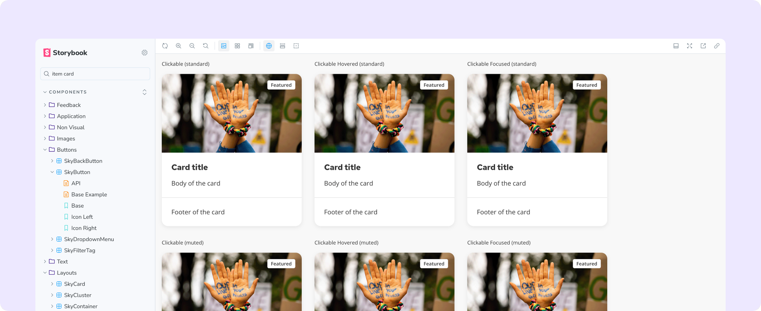
Storybook as the live coded component reference alongside Replit — every variant, state, and prop documented and interactive.
THE AI DESIGN LANGUAGE
Building the visual language before the ask came.
Before any AI features were on the roadmap, I started researching. For Benevity - processing millions in charitable giving - AI had to feel trustworthy, not just capable. The answer: establish a visual framework first, before product teams made individual calls that would need reconciling later.
WHY THIS VISUAL LANGUAGE
I explored three directions - typographic only, monochrome, colour-based. The first two failed: text labels disappear in dense forms, border weight is invisible unless you're looking for it. Colour was the only signal that worked at a glance across all contexts.
Visionary Violet met all three constraints: distinct from all five client brand palettes, AA accessible on dark and light surfaces, not already carrying meaning in the UI. Static violet for presence. Gradation for active processing. State communicated without copy.
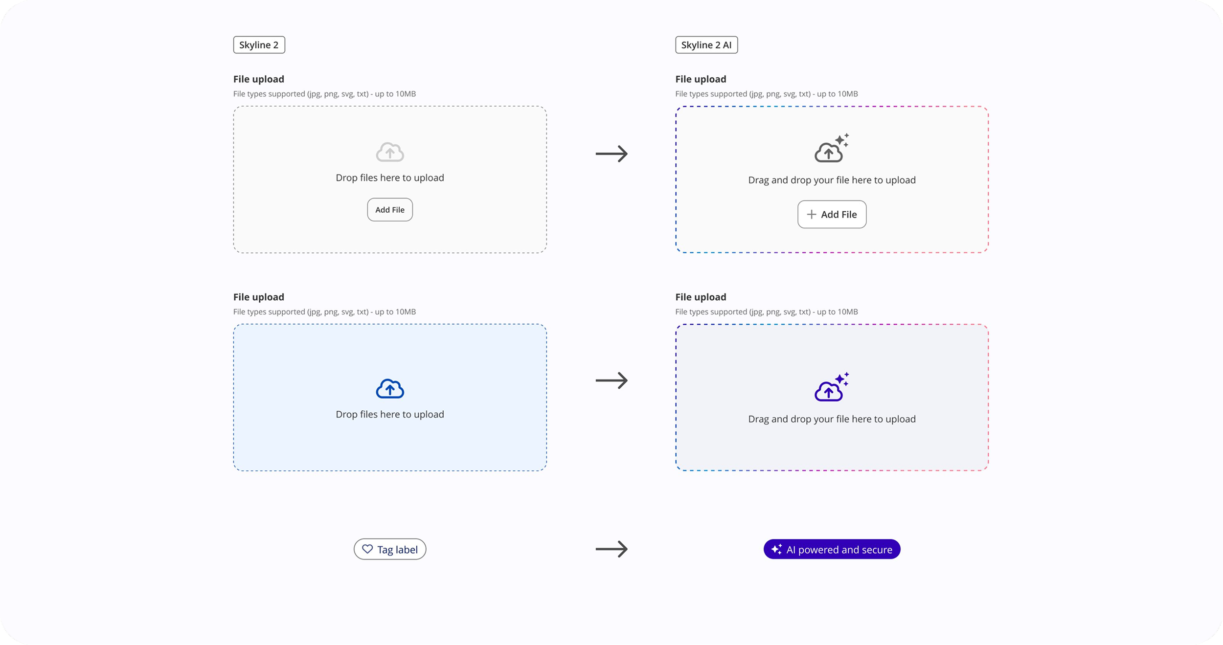
Skyline 2 → Skyline 2 AI. Existing components extended - not replaced. The gradation border, AI iconography, and badge emerged from what was already in the system.
THE PRINCIPLE
Style components based on what they are, not what they control.
A text input that AI reads after the fact looks like any other input. A file drop zone that triggers an AI workflow is an intelligence gateway - it needs to look like one. Without this principle, teams make individual calls that accumulate into inconsistency.
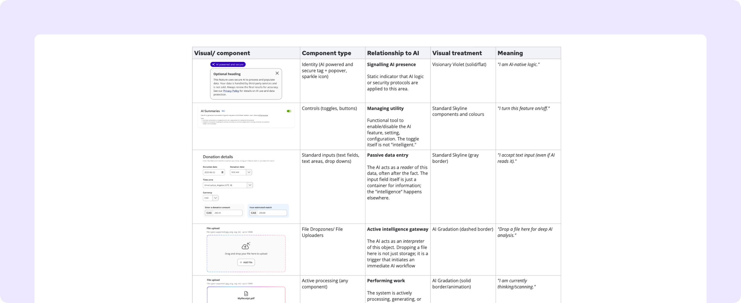
The AI visual taxonomy — component type mapped to its relationship with AI, visual treatment, and meaning.
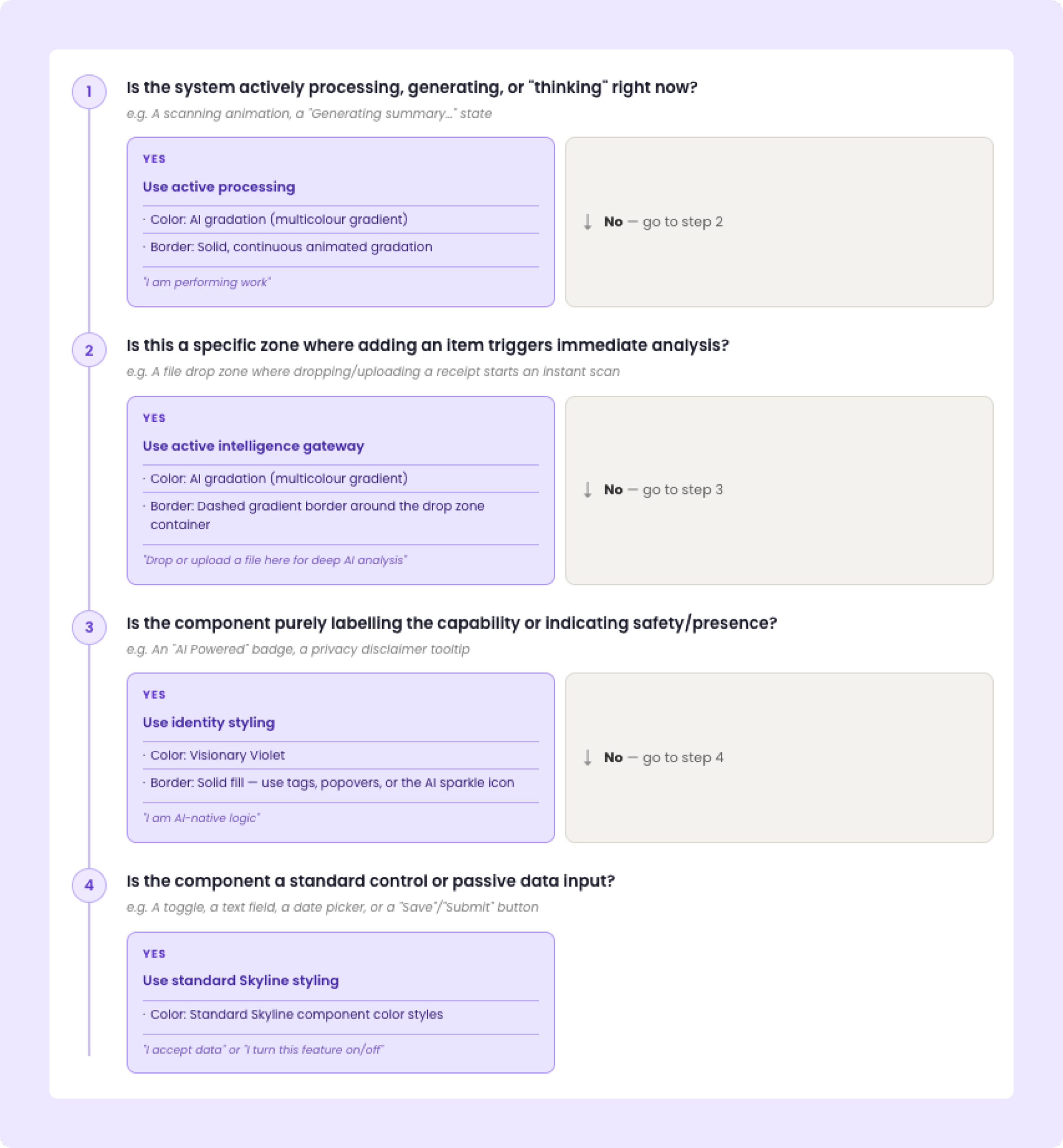
DECISION TREE
Four questions. Every product team. No guessing.
KEY DECISIONS
Trust vs. visibility
The temptation was to make AI highly visible everywhere.
The risk: visual noise that erodes trust.
The decision: AI branding appears once per context, at the entry point. After that, the system gets out of the way.
Ship patterns or wait for perfection
AI features were coming whether the framework was ready or not.
The decision: ship a principled v1 that gave teams enough to move - knowing it would evolve - rather than block product work waiting for a complete system.
COMPONENTS BUILT
AI Badge / Trust Indicator, File Drop Zone, Processing Indicator - each with placement rules, interaction states, and decision guidance.
Three distinct AI states: intelligence gateway (drop zone), active processing, and identity / trust signal (AI badge + privacy popover).
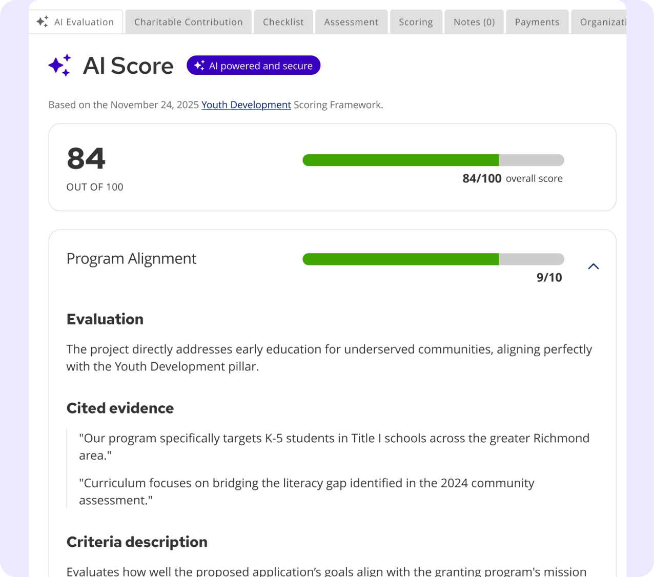
AI SCORE
The badge and sparkle iconography carry directly into the admin grants evaluation context.
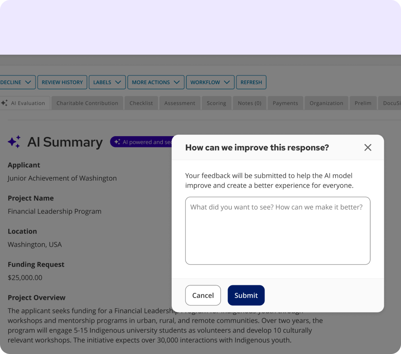
AI SUMMARY
With feedback mechanism - same trust signals, same component system, different product area.
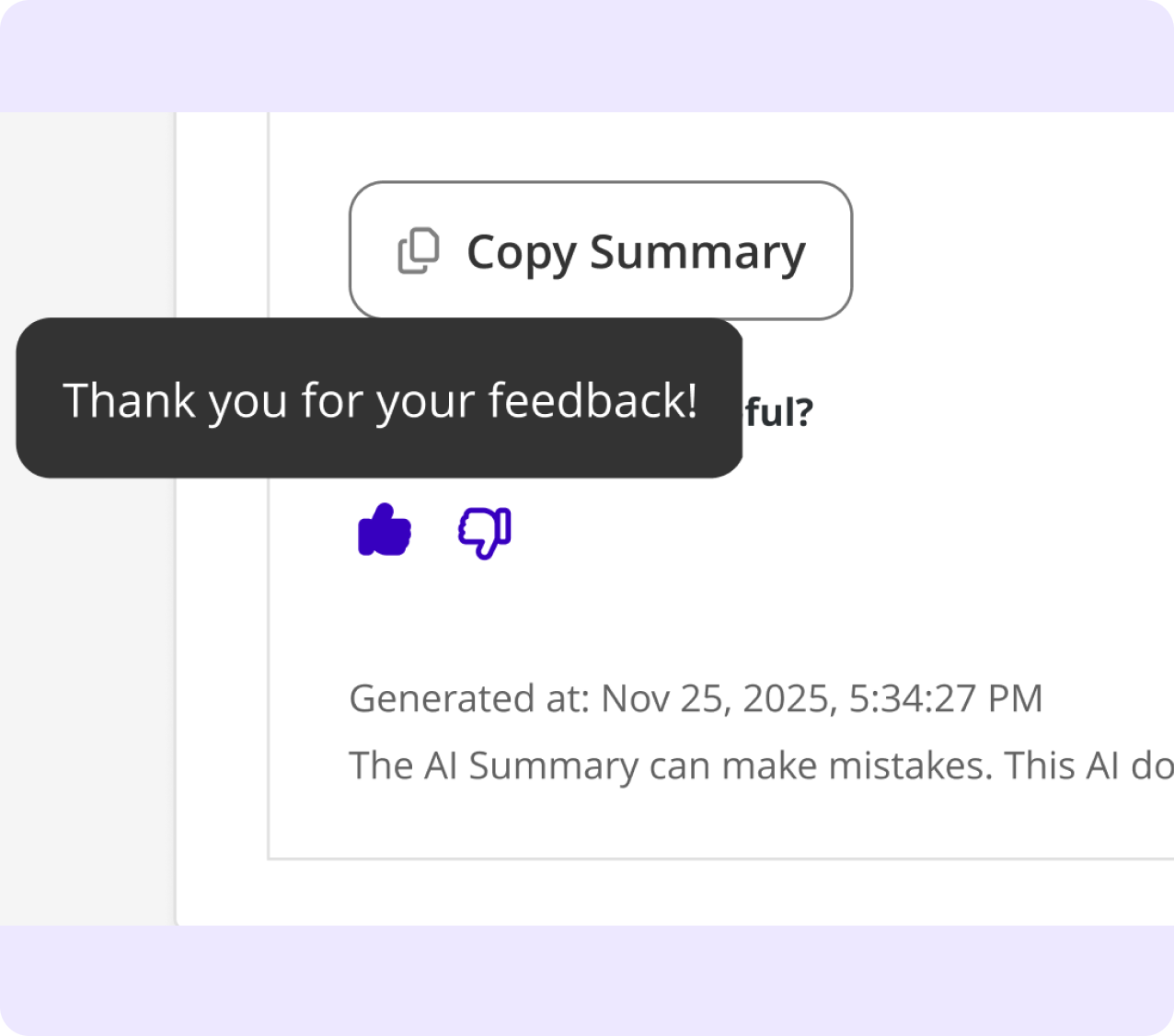
FEEDBACK MESSAGING
The loop closes with a toast, reinforcing AI transparency throughout the interaction.
FIRST IMPLEMENTATION
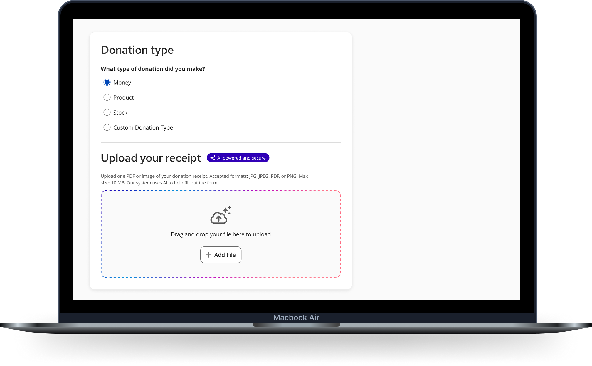
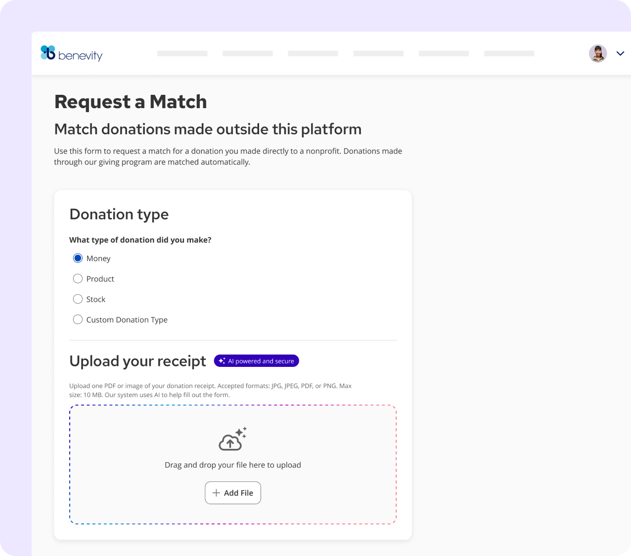
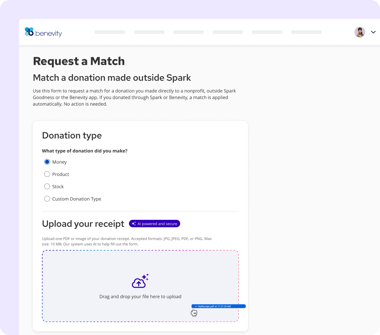
The framework meets reality: EMR receipt validation.
Employees submitting donation match requests filled out long forms manually - and incomplete submissions got rejected. The solution: upload your receipt, let AI do the reading. Fields populated. Gaps surfaced before submission, not after rejection.
The goal wasn’t to automate the form - it was to give user’s confidence that their submission had what it needed to be accepted
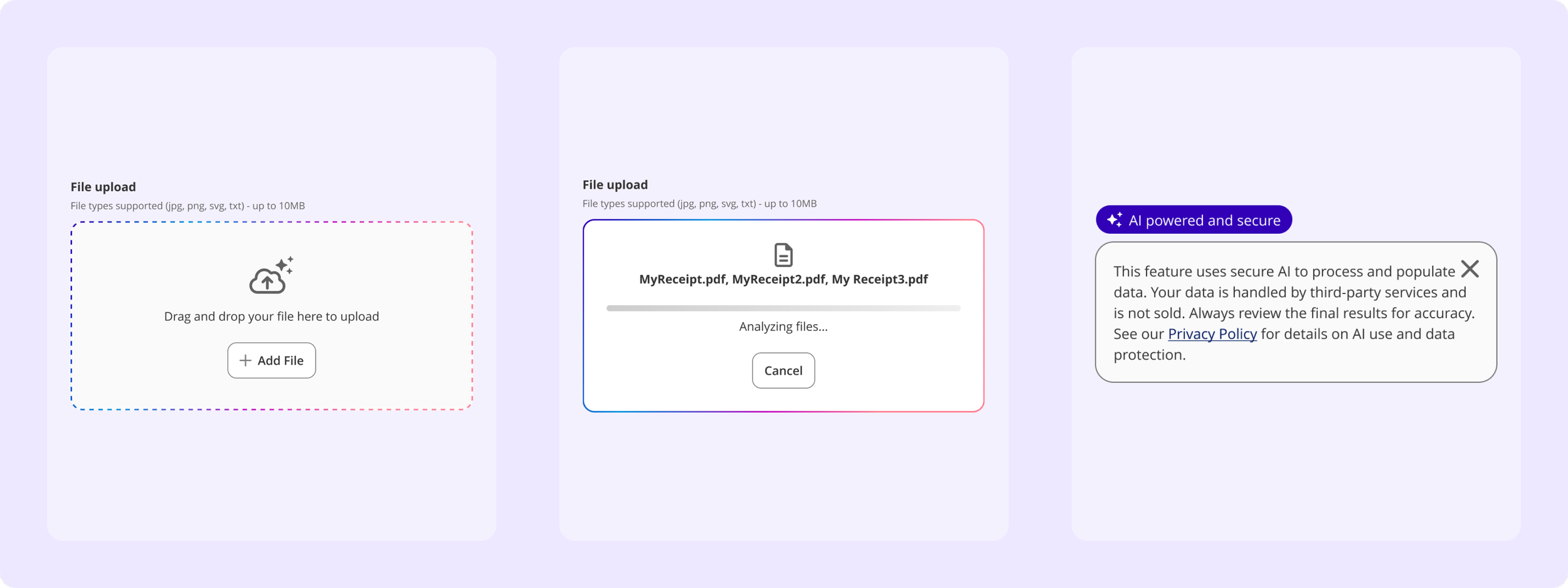
READY TO RECEIVE
AI badge signals involvement upfront. Dashed gradation border signals: this upload does something intelligent.
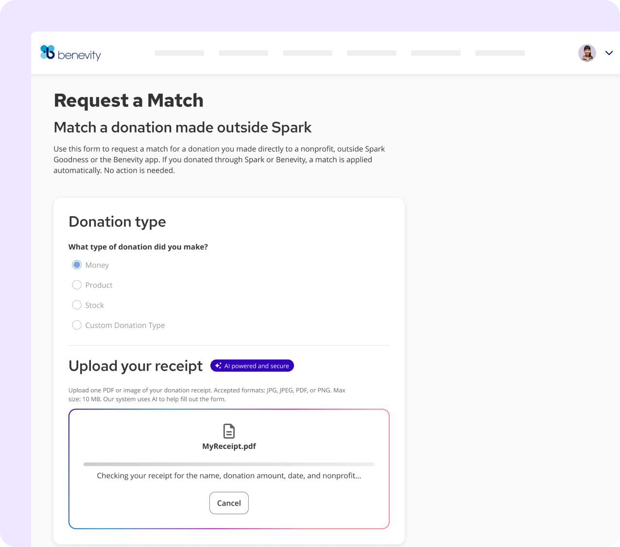
FILE RECEIVED
Gradation border activates - the drop zone becomes an intelligence gateway, not just storage.
AI SCANNING
Shimmer animates. The copy dynamically updates to state exactly what's being reviewed - constantly keeping the human in-the-loop.
THE RESULT
A successful scan populates the form and confirms validity. A partial match surfaces the specific issue - resolved before submission, not after rejection.
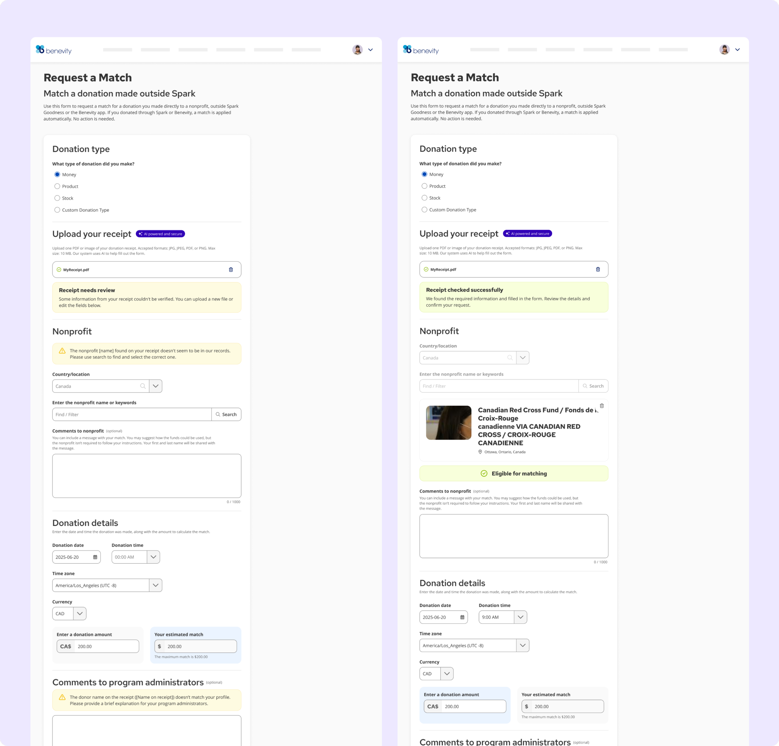
"Receipt needs review." Specific problem surfaced before submission. User can resolve without rejection.
"Receipt checked successfully." AI populated the nonprofit, date, amount.
IMPACT
From stale docs, 13 designers interrupting daily to self-service docs, a shipped AI visual language, and a framework ready to scale cross-org.
BUSINESS OUTCOME
Product teams ship AI features without inventing the design language each time. Every touchpoint feels like a system decision, not a one-off call.
Questions that previously required a Skyline response now have a documented answer. Team capacity went toward building, not explaining.
The work compounds. Each new AI feature makes the next one faster to design and easier to trust.
LEARNINGS AND REFLECTIONS
What this work has taught me.
1
Content infrastructure before intelligence.
Google Docs had to exist before SkyDocs could work - NotebookLM is only as smart as what it queries. Next time I'd move to the AI layer faster once the content was stable. Design your documentation to be machine-readable from day one.
2
Vision and v1 are not the same thing.
The full component inventory existed. Only a few needed to ship to unblock product teams. The discipline was resisting the pull to build everything before shipping anything. Knowing what to defer - and defending that decision - is the job.
3
Figma is the wrong primary tool for design systems - and the industry hasn't caught up yet.
Watching the team prototype in Replit with Storybook as reference made it clear: the fastest path from design decision to working product no longer runs through a Figma handoff. Velocity isn't the challenge. Quality and consistency when AI generates UI faster than any team can review it - that's the unsolved problem.
These are the things I'd do differently, push harder on, or think about more carefully next time.