
An origin story
As the demand for the Symend product began to gain traction, there became a pressing need for consistent and reusable code and visual elements. As the focus shifted towards self-service and a unified application, design processes required streamlining to keep pace with business demands and stay competitive in the market against sleeker, modern web apps.
Project scope
End-to-end web app, branding
Role
Product, UX, UI Designer
(Research, Visual Design, Interaction Design, Usability Testing)
Tools

In response to the need for consolidation, Symend embarked on a mission to merge two separate web application platforms into one cohesive, user-friendly system. Originally crafted by developers, both platforms suffered from a lack of a unified design system, leading to significant inconsistencies between them.
To understand the requirements thoroughly, I began by examining the two platforms, meticulously cataloging UI elements, and grouping similar components for analysis and interpretation.
1. Design variations in functionally similar components
Multiple components had the same or similar functions but different visual designs, making the system less predictable and harder for users to understand.
2. Inconsistent button design
Buttons, crucial for user interaction, varied in design across the platform, causing uncertainty and hesitation in users about their functions.
3. Resulting user confusion
The inconsistencies and variations led to users being unsure about how certain elements worked, leading to potential mistakes and a steeper learning curve.
These insights were vital and laid the groundwork for building the Design System


Inspired by Symend's core values, I chose a palette of blues and greens to revitalize the design system's branding.
The original brand colours - lime green and black felt mismatched, while pink and red sparked feelings of empathy. Ultimately, blue, synonymous with compassion, became our primary interaction color, while teal was selected for navigation. This shift not only enhanced the app's visual appeal but also heightened user intuition.
Strategies for unity, accessibility, and longevity
A cohesive, adaptable, and user-friendly design system requires clear guidelines on layout, typography, and color. It should undergo rigorous testing with stakeholders like developers and managers to ensure unity and accessibility. Using internal feedback and usability tests will identify system gaps, and regular updates will maintain its relevance over time.
Goals
Ensure component consistency
Distinguish between actionable and navigational colors
Streamline components for clarity
Minimize user confusion
Continuously refine with new features
Approach
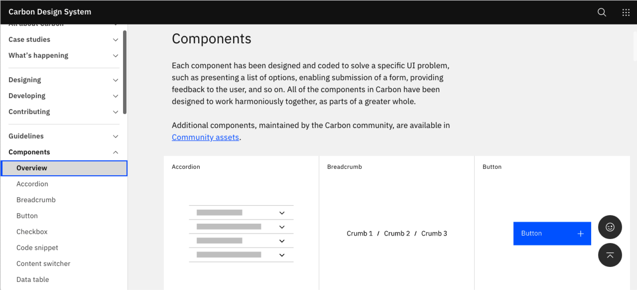
Study design systems of industry giants: Spotify, IBM, Google, Apple
Identify essential components and differentiators for Symend
Set component criteria using thorough research and analysis


Component/ screen audit (left), Samples of the button variations found in the audit of the two apps (right)

Samples of the two previous web app platforms
1. Brainstorm Component Needs
Navigating the components necessary for our design system proved challenging without specific flows to guide us, especially as we were concurrently reimagining and streamlining existing processes into a new application. As a team, we brainstormed potential components and categorized them by the applicable domain area that corresponded to the current applications to facilitate the process.
2. User-Centric Design Iterations
Design inherently involves iteration and evolution. Maintaining consistency is paramount to ensure that components align with the brand's vision. I explored diverse design concepts, iteratively refining them based on user feedback regarding aesthetics and functionality.
3. Documenting component usage and best practices
Documentation is vital, it offers context and answers, serving as a crucial resource for developers and product managers. By documenting the design system, we clarify component functionalities, their appropriate use, and best practices, addressing any user queries.

During user interviews, feedback highlighted that the teal colour used in the app gave it a dated appearance, particularly noticeable due to its widespread use in the button component.


Follow the button leader
The initial building block for the design system was the button component. This choice was based on its high frequency of use throughout the interface. By establishing the button's specifications, we were able to ensure consistency in the design system's appearance, interactive states, and overall feel, serving as a foundation for other components to build upon.

A Miro board that was used for brainstorming the who, what, how, and when for testing each component in the design system


And then there was a style guide…
To facilitate seamless communication with the development and product teams, I created a comprehensive style guide. Merging this with our design system significantly optimized our workflow. Our front-end team transformed Figma designs into coded tokens, adopting uniform naming conventions over simple hex codes for components.


Sharing out the design system
We adopted Netlify's Storybook for documenting our Design System, facilitating easy sharing and feedback collection among the team. It also proved crucial in ensuring alignment between design specifications and the actual code.


The Design System's implementation has achieved our set objectives, resonating with our design vision. Internal feedback highlights its success in embodying the Symend brand. This initial version has fulfilled its mission, and upcoming case studies will spotlight specific projects, illustrating the transformative impact of the Design System on our interface.