
What is Symend?
Symend is a platform that transforms customer challenges into engagement opportunities, offering timely, personalized messaging that evolves with customer needs.
What is a Playbook?
The Symend platform mainly operates off of what we call “Playbooks”.
A "Playbooks" is a tool that uses understanding of human behaviour to help customers who are struggling financially. Instead of a one-size-fits-all method, it offers specific solutions based on each customer's situation and adjusts based on feedback.
Project scope
End-to-end interface flow, testing, iteration
Role
Product, UX, UI Designer (Research to Usability Testing)
Tools

By 2020, Symend evolved to unify two separate platforms into one user-centric system
Platform challenges
1. Technical limitations:
The platforms, being hard to scale and internally managed, needed evolution towards a self-service model due to client demand for customization.
2. Data complexity
Needed to streamline abundant intricate customer data for tailored interactions.
Observing users interacting with the current platforms

Due to a lack of visual aids, users struggled to swiftly analyze and comprehend various data points

Example screens within the flow of creating customer treatment strategies in the previous platform


From user interviews, "Patty, the Playbook Designer" was created as a central design persona.
Tasks and background
Manages Playbooks and checks performance
Has marketing/customer engagement experience

Disjointed processes involving navigation across two apps created confusion and necessitated workarounds for users


I extensively navigated the primary processes and steps in the two prior platforms, pinpointing areas where inefficiencies consumed extra time and identifying key opportunities to streamline and enhance the overall user experience by bridging disjointed processes.
Major concerns in the current user experiences
1. Clunky interactions
Content creation lacked interactivity
Restricted previous setup hindered efficient operation
2. Non-Existent Versioning
Users couldn't delete templates so they employed workarounds, like marking "DELETE," on templates so other users would know to not use them. These workflows were inefficient and hindered version tracking and efficency.
3. Non-Intuitive Naming
Template names were unclear to new users.
Collaboration was challenging due to internal jargon.
The user experiences ultimately lacked a clear user progression to direct them towards configuring treatment strategies.

Goals
Streamline content delivery
Engage effectively with overdue bill customers
Seeks strategic outcomes assurance

The use of technical jargon in interface terms made it unfamiliar and impeded user comprehension.
Challenges
System doesn't match workflow
Fragmented tools
Forced early content drafting

Excessive information, in the form of dense text and forms, led to user confusion and obscured clear pathways to their goals
Business priorities
Solution strategy to meet business and user needs
Simplifying, enhancing, and scaling the platform for optimal digital engagement through:
User self sufficiency
On the new platform, users can experiment with various features on their own. They'll also be able to view and analyze their data without waiting for assistance.
Universal functionality
Offer features that cater to the needs of most users, eliminating the need for special customizations and ensuring a standardized yet flexible experience.


Seamless client integration
Move 80% of current clients to the new user-friendly platform, making the transition smooth and efficient.
Unlocking innovation
Equip users with tools for effective digital engagement, tailored to each client's unique needs.


Adaptability
Transform the platform from a static tool to a dynamic solution.


Simplified processes
Offer a fluid user experience by integrating fragmented parts.
Expanding capabilities:
Introduce advanced features to serve a multitude of use-cases such as experimentation.
Scaling efficiently
Empower internal teams, reducing dependency on the system and decreasing errors.

Reliable platform access
The platform will be consistently available, running almost always without interruptions, ensuring business continuity and customer satisfaction.


The diagram compares the previous multi-app method to the new unified platform. Playbook Designer content is refined via Content builders for outreach, combining behavioral science with data-driven techniques.
Leveraging familiarization from industry standards
By studying other customer engagement platforms, I identified which features to adopt or adapt from the previous platform experiences. It was crucial to blend innovation with user-friendly elements that were familiar and intuitive.
Two main takeaways to implement:
1. Personalization & Predictive UX
Adaptive Customization: Platforms utilized intensive user data analysis to provide tailored content and UI adjustments based on user preferences.
Predictive Assistance: Platforms anticipated user actions, offering suggestions or preloading elements for a smoother experience.
2. Simplified & Modular Design
Card Layouts: Data and information were structured in modular "cards" for organized, clear presentations, especially in data-rich environments.
Micro-interactions: Subtle animations, like button color shifts on hover or feedback animations, were used to grab the attention and inform users.

Interactive canvas iterations


Validating assumptions
Using user interviews, I delved into their experiences with past applications and their daily tasks' alignment. I then tested early prototypes to validate assumptions and assess user reactions to the revamped strategy design method.
1. Which aspects of the treatment strategy workflow are crucial?
Users prioritized understanding customer pathways and their interactions with engagement touchpoints.
2. How much detail and adaptability do users expect from the interface?
Initially, users sought guidance and preferred tools to be introduced gradually, making the transition smoother, especially given their experience with prior limited interfaces.
3. Are key interactions intuitive and expected?
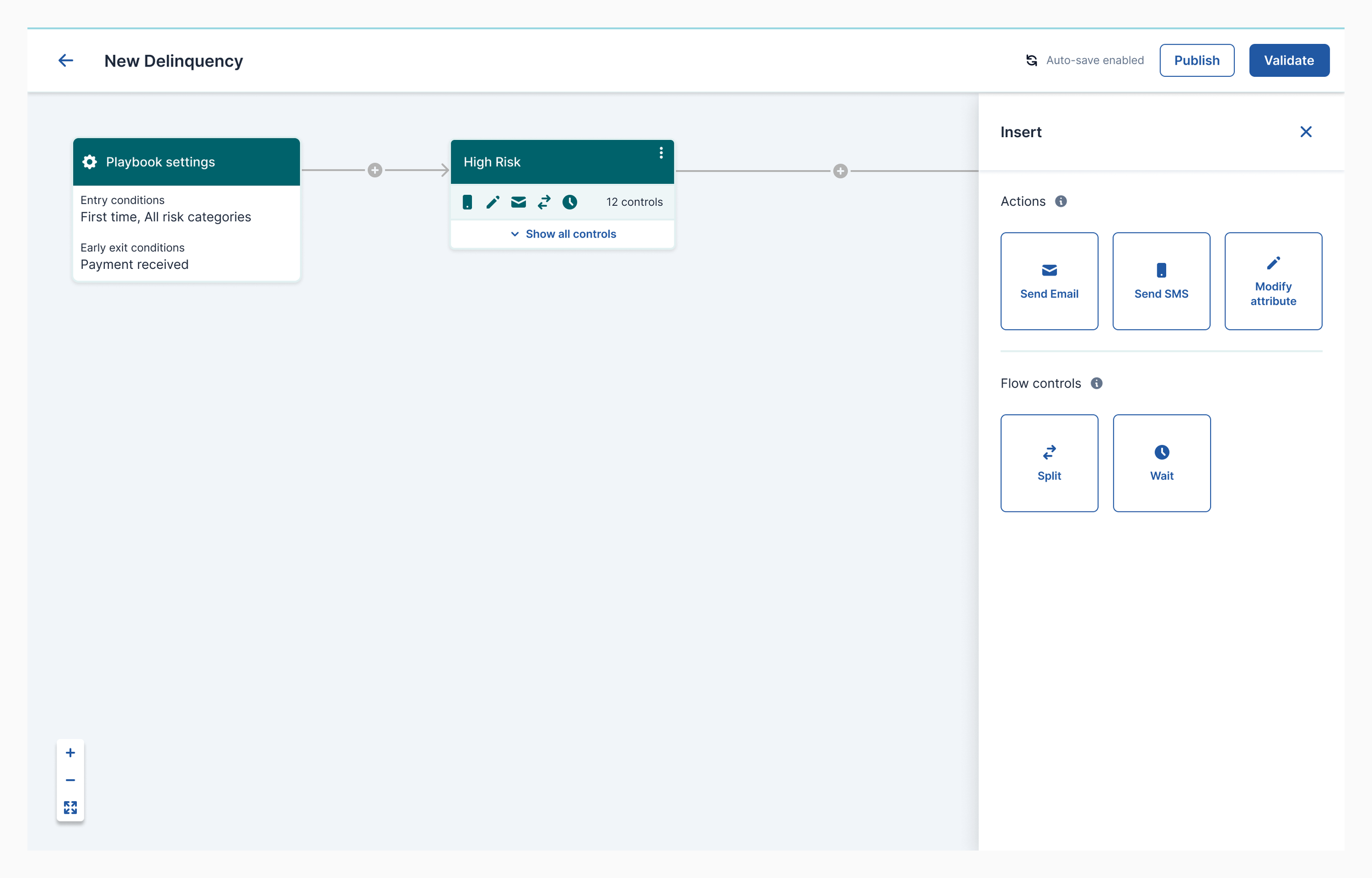
For the interactive editor, ensuring actions were intuitive was essential. We simplified interactions, using recognizable symbols like “+” for adding, ensuring user predictability.

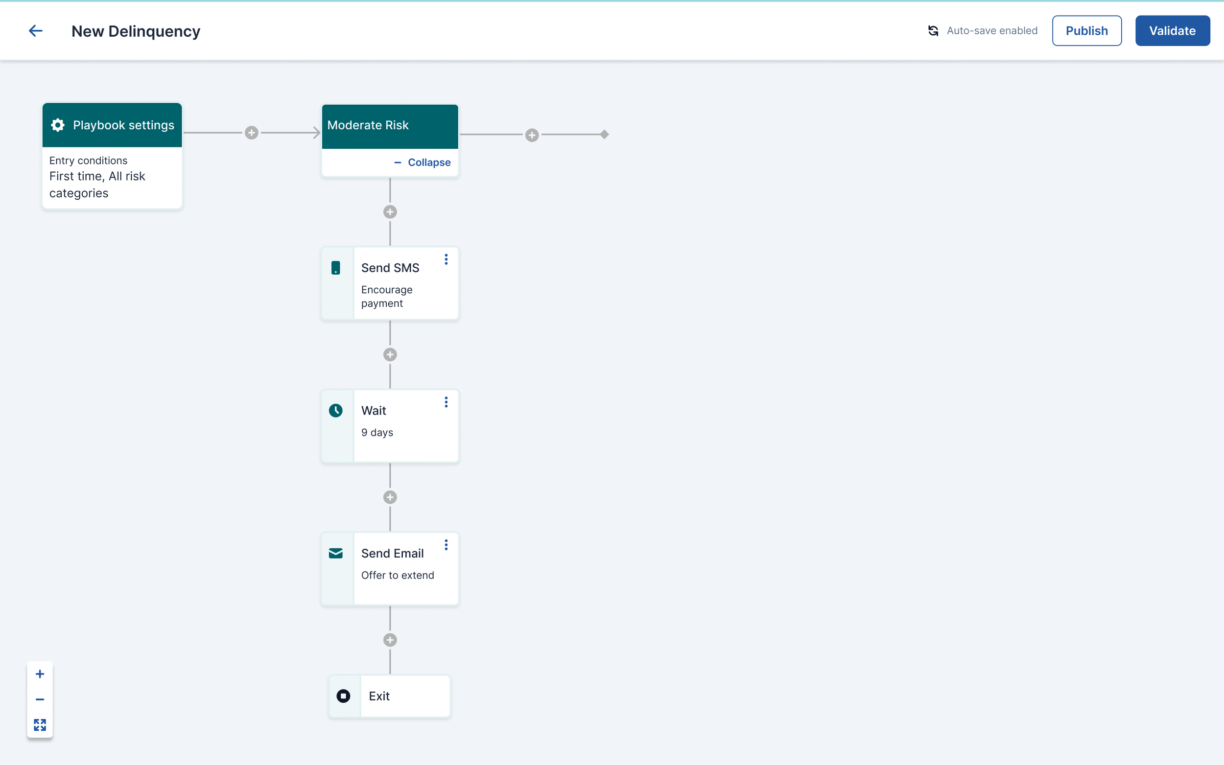


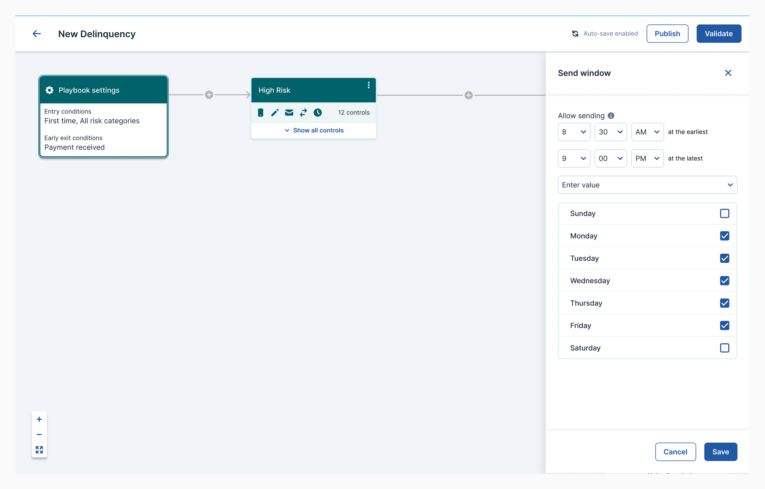
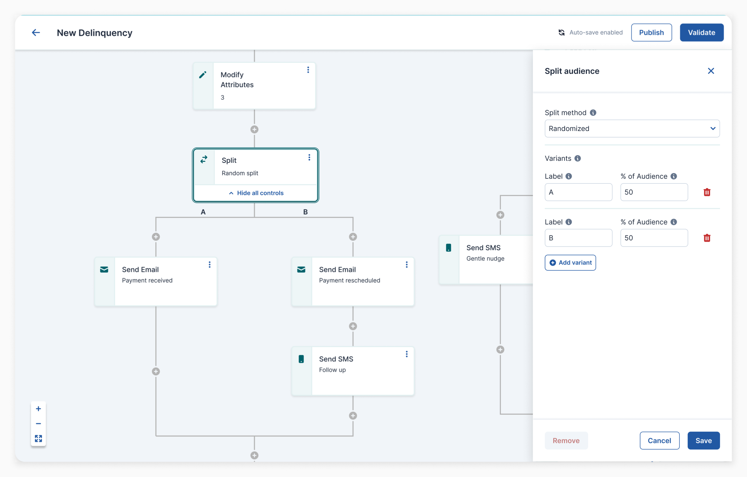
In the final design the node controls were widened to display more information, accommodate longer campaign names, and show the number of active controls within campaigns using icons. This provides users an overview, especially in complex Playbooks, and reduces the chances of truncating control labels.
Insert control panel iterations


An enhanced user experience
1. Unified Platform
Users now access a singular, interactive canvas, replacing the fragmented multi-app experience. This unified journey eliminates user guesswork.
2. Intuitive Design
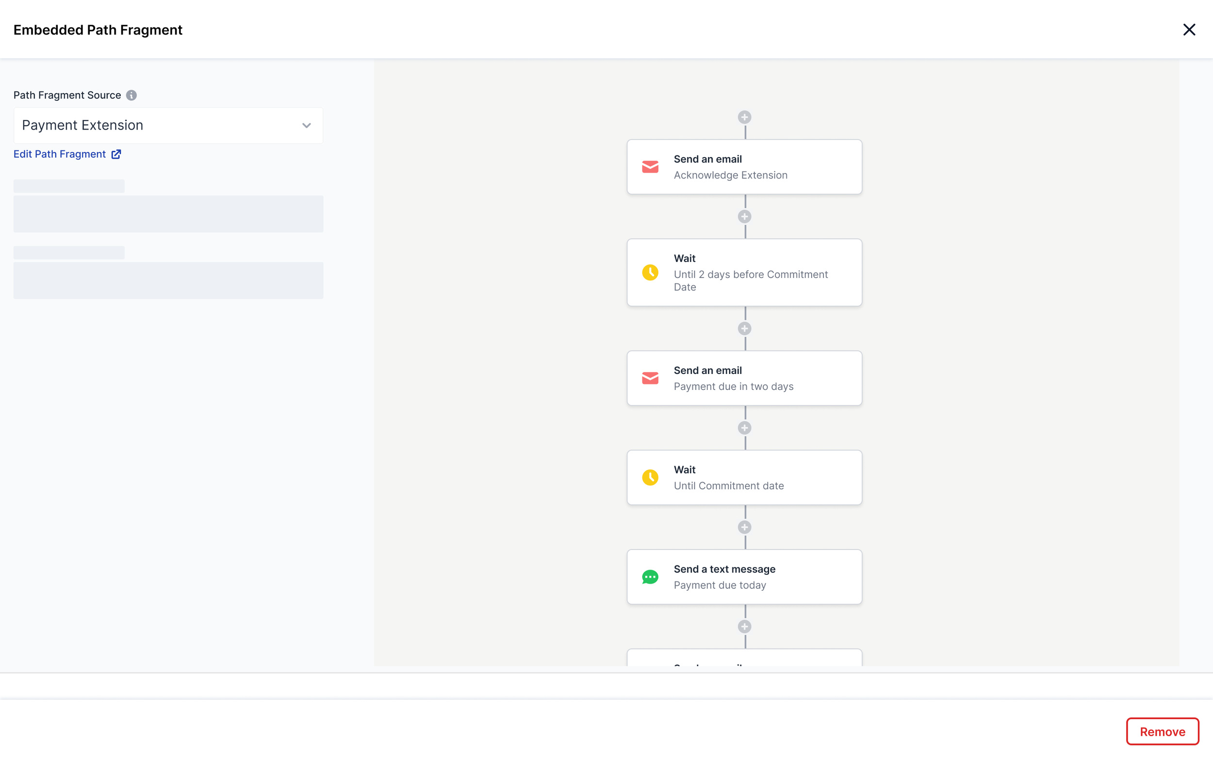
The Playbook designer is a versatile canvas, allowing users to craft targeted campaigns with a variety of tools at their disposal.
3. Optimized Information Presentation
Although the new Playbook designer contains more information, its organized hierarchy and clear visuals ensure easy readability and quicker data retrieval.
4. Consistent Interactions
The platform offers dependable, repeatable interactions. For instance, using the "+" icon to insert campaigns or controls streamlines user tasks, making the experience predictable and intuitive.

Flow demonstrating the re-designed Playbook Designer experience
Some examples of before and after feature transformations
Inserting a new control
Before
After

Creating/ editing an experiment
After

Before

Final thoughts
Reflecting on our transformation from a rigid code-based system to a dynamic canvas is motivating. The new Playbook Designer not only met but exceeded our goals, proving superior to earlier versions after thorough testing. Its success shows that despite tech challenges, streamlining processes and emphasizing user-friendliness leads to efficiency, precision, and smart resource use.